How to Choose Enamel Pin Colors: A Complete Color Palette Guide
A beginner-friendly deep dive into Pantone color selection, special effects, plating choices, and cost-saving strategies — everything you need to get your pin colours exactly right the first time.
Color is one of the most powerful decisions you’ll make when designing a custom enamel pin. Get it right and your pin pops with clarity, personality, and production accuracy. Get it wrong and you risk unexpected color shifts, higher costs, manufacturing defects, or a finished pin that looks nothing like your original artwork.
This guide covers everything — from choosing Pantone numbers and understanding special effects, to how plating choices shift color perception and practical strategies to control costs without sacrificing quality.
Quick Recommendations (TL;DR)
Short on time? Here are the most important color rules for enamel pin production at a glance:
- ✓Use Pantone Solid Coated (PMS) colors — the only color system that gives manufacturers an accurate physical reference for enamel mixing
- ✓For metallics, use plating — gold, silver, rose gold, antique brass, and black nickel are plating choices, not enamel pigments
- ✓Limit fills to 2–4 colors for small runs — maximises cost efficiency and minimises defect risk
- ✗Avoid tiny color islands — areas under 2mm² are prone to overflow and hard to fill cleanly
- !Consider soft enamel for budget/textured runs — hard enamel gives a smoother premium finish but at slightly higher cost
- !Always request a pre-production sample for any order where color accuracy is critical to your brand
Why Color Choice Matters in Enamel Pin Production
Unlike digital design or print, enamel pin manufacturing is a physical, multi-step process. Enamel colors are mixed pigments fired or cured into recessed metal areas — not printed ink. This means the rules are fundamentally different from screen design or even offset printing.
How Enamel Pins Are Colored
- A metal mold or die is stamped to create the pin shape with raised metal walls (cloisonné lines) separating each color area
- The pin is plated in the chosen metal finish (gold, silver, etc.)
- Enamel pigment — a powdered glass or resin compound mixed with pigment — is filled by hand into each color area
- For hard enamel, the pin is polished flush; for soft enamel, the enamel sits recessed below the metal lines
- A clear epoxy coat may be applied for gloss protection or dome effect
Every step in this chain can influence the final enamel pin colors. Understanding this process helps you design colors that survive production faithfully — and avoid nasty surprises when your shipment arrives.
📌 Key Insight: Color on screen is made of light (RGB). Color in print is made of ink (CMYK). Color in enamel is made of physical pigment mixed by hand. Each system has different rules — and Pantone is the only color language all three can translate between reliably.
Color Systems: Pantone vs HEX vs RGB
There are three color systems you’ll encounter when designing pins. Understanding what each one is — and what it is not — prevents the most common color miscommunication between designer and manufacturer.
| Color System | What It Is | Used For | Production Accurate? |
|---|---|---|---|
| Pantone (PMS) | Physical ink/pigment standard with numbered chips | Print, branding, manufacturing, enamel mixing | ✅ Yes — the industry standard |
| HEX (#RRGGBB) | Web color code defining screen-displayed color | Web design, digital mockups, CSS | ❌ No — screen only |
| RGB (R,G,B) | Light-based color model for screens | Digital art, photography, video | ❌ No — screen only |
| CMYK | Ink-based subtractive color model | Offset & digital printing | ⚠️ Partial — useful approximation but not enamel-accurate |
Why Pantone Is the Only Safe Choice for Enamel
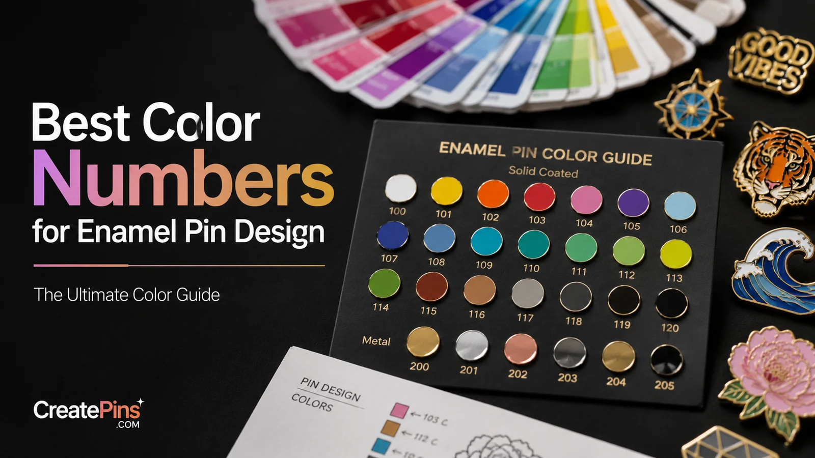
Pantone’s Solid Coated (PMS) fan deck gives manufacturers a physical reference chip to match enamel pigment against. When you specify Pantone 185 C, the factory knows exactly which red you mean — without any interpretation. When you specify HEX #FF0000, the factory must guess which red pigment best approximates what your screen shows, and screen colors vary between devices.
💡 Practical Tip: If you designed in a digital tool and only have HEX codes, you can convert them to approximate Pantone matches using the Pantone Color Finder or Adobe Illustrator’s built-in color libraries. However, be aware that these conversions are approximations — the actual Pantone chip will always be the definitive reference.
Which Pantone Book to Reference
- Pantone Solid Coated (C suffix) — the primary book used for enamel pin production; the “C” suffix means coated, which most closely matches the glossy surface of plated metal
- Pantone Solid Uncoated (U suffix) — not recommended for enamel pin color specs as the uncoated appearance differs from coated finishes
- Pantone Metallics — applicable for metallic enamel effects (though actual metallic results require plating, not enamel)
Recommended Pantone Color Numbers
The following colors translate reliably from Pantone specification to finished enamel pin. They are widely stocked by manufacturers, reproduce cleanly, and suit a broad range of design styles.
⚠️ Important: Pantone-to-enamel matching is an approximation, not an exact science. Enamel pigment mixing, plating choice, lighting conditions, and finishing all influence how a color appears in the final pin. For color-critical orders — branded merchandise, official licensed products, or reorders that must match previous batches — always request a pre-production (PP) sample before approving full production.
How Many Colors Should Your Pin Have?
The number of distinct enamel color fills in your design is one of the biggest decisions you’ll make — affecting production complexity, cost, defect risk, and visual clarity. Here is a practical guide for each color count range.
| Color Count | Best For | Cost Impact | Production Risk | Visual Result |
|---|---|---|---|---|
| 1–2 colors | Logos, minimalist icons, simple shapes | Lowest | Very low | Bold, graphic, high contrast |
| 3–4 colors | Most character pins, brand mascots, illustrated scenes | Low–moderate | Low | Colourful, clear, versatile — the sweet spot |
| 5–6 colors | Complex character art, detailed scenes, multi-element designs | Moderate | Moderate | Rich and detailed — manage carefully |
| 7–8 colors | Premium collector pins, large format designs | High | Moderate–high | Impressive but requires expert execution |
| 9+ colors | Special projects with large budgets | Very high | High | Consider mixed enamel + printing instead |
💡 Designer’s Rule of Thumb: Use plating metal and negative space as visual elements in your palette. A gold-plated pin with 3 enamel colors often reads as richer and more complex than a silver-plated pin with 5 colors — because the metallic surface becomes a design element in its own right.
Sample Color Palettes by Design Style
These curated palettes are proven to work well in enamel production. Each uses 3–5 colours and is built around high contrast and clear separation for maximum visual clarity at pin size.
🌸 Kawaii / Pastel
Soft, approachable, and popular for anime-inspired and cute character pins. Works especially well with gold plating to add warmth.
1767 C
290 C
712 C
337 C
289 C
🔥 Bold & Graphic
High-contrast palette for eye-catching logos, mascots, and statement pins. Performs well at small sizes because color areas are clearly distinguishable.
185 C
123 C
Black C
🌿 Earthy / Vintage
Muted, warm tones that feel nostalgic and handcrafted. Antique gold or antique brass plating enhances the vintage aesthetic significantly.
4625 C
374 C
141 C
7526 C
9183 C
🌊 Cool Minimalist
Clean, modern palette ideal for brand merchandise, tech companies, and geometric designs. Works beautifully with silver or dye-black plating.
286 C
290 C
2767 C
📌 Colour Contrast Tip: Always test your palette by printing your design in greyscale. If all color areas blur together when the color is removed, you need to increase contrast — the differences in shade and tone must be visible, not just the hue. This is especially important for small pins where fine details are harder to distinguish.
Special Effects: Glitter, Translucent, Glow & More
Beyond standard opaque enamel, there are several special effects that can add visual interest, premium appeal, and uniqueness to your pins. Each comes with its own cost, technical limitations, and color behavior that you need to understand before specifying them.
✨ Glitter Enamel
Enamel mixed with metallic flake or glitter particles. Adds sparkle and movement. Note: heavy glitter load introduces a silvery tint that shifts the base color — specify your Pantone knowing this shift will occur. Best used in larger color areas where the effect can be seen clearly.
🔮 Translucent / Transparent Enamel
Like colored glass — the metal beneath shows through. The plating color dramatically affects the result: gold plating under red translucent creates orange-red; silver creates a truer red. Best specified with a dedicated PP sample as the interaction between plating and translucent color is hard to predict from mockup alone.
🌙 Glow-in-the-Dark Enamel
Glow pigment is naturally off-white or yellowish in daylight before charging. Daytime color will not match your digital mockup unless the design is specifically built around this. Works best when used alongside dark surrounding colors that contrast dramatically when the glow activates in the dark.
🎨 Printed Enamel (Offset / UV Printing)
A printing plate applies photographic or gradient-detailed color to the pin surface, then sealed with epoxy. Allows smooth gradients, photorealistic detail, and color complexity impossible with standard enamel fills. Higher per-unit cost but eliminates the color-count ceiling entirely. Ideal for portrait pins, complex illustrations, or full-bleed photographic designs.
💎 Epoxy Dome (Clear Resin)
A clear dome of resin applied over the finished pin surface. Adds a glossy, magnifying, protective effect. Can intensify colors slightly and protect printed detail. Note that the dome makes enamel appear to deepen slightly in perceived tone.
🌈 Color-Shifting / Mood Enamel
Specialist pigments that shift hue depending on viewing angle or temperature. A premium effect that works best in larger color areas. Specify with caution — the “default” color and the shifted color should both be aesthetically pleasing and complement your overall design.
💡 For Metallics: Use actual plating rather than trying to simulate metallic effects with enamel pigments. Gold, silver, rose gold, antique brass, and black nickel plating are applied to the metal body of the pin and always produce a more convincing, durable metallic appearance than any enamel pigment can achieve.
Plating Choices & How They Affect Enamel Pin Colors
Plating is the metallic finish applied across the entire surface of your pin before enamel is filled in. It defines the color of all raised metal lines (borders), the back of the pin, and the clasp — and it strongly influences how enamel colors are perceived by reflecting light into the filled areas.
📌 Design Rule: For the most accurate, stable enamel color representation, choose silver or dye-black plating. Gold and rose gold create the strongest color shift — warm them up in your Pantone selection to compensate, or accept that colors will appear warmer in the final pin than in your digital mockup.
How Production Factors Shift Your Enamel Pin Colors
Even with a perfectly specified Pantone number, several manufacturing variables can shift the perceived color of the finished pin. Understanding these factors helps you anticipate the result — and design to compensate where needed.
1. Plating Color Reflects Into the Enamel
The metal beneath and around the enamel reflects light into the filled area, creating a subtle but real color shift:
Pantone specified: 123 C (bright golden yellow)
Result: Gold plating’s warm reflection makes the yellow appear 1–2 tones more orange than expected from the Pantone chip alone.
Pantone specified: 290 C (pale blue)
Result: Silver’s cool neutral reflection makes the blue appear slightly colder or more faded than the Pantone chip — but also more faithful than gold plating would produce.
2. Soft Enamel vs Hard Enamel Color Perception
Even with the same Pantone specification, the surface texture of the enamel type affects the perceived color:
Soft enamel: sits recessed below the metal lines → more shadow falls across the surface → color appears slightly deeper and richer.
Hard enamel: polished flush with the metal → maximum light reflection → color appears slightly lighter, cleaner, and more saturated in bright light.
3. Translucent Enamel Behavior
Translucent enamel is like colored glass — whatever metal is beneath shows through and mixes with the enamel tone:
The gold’s warm base tone mixes with the translucent red, shifting the result toward orange-red. The same translucent red over silver plating produces a truer, cooler red.
4. Glow-in-the-Dark Pigment
Glow pigment has its own visible base color before it charges and glows in the dark:
In daylight: appears as a light cream or off-white color — not blue at all.
In the dark after charging: emits a blue glow.
Design implication: Designs using glow enamel must be planned specifically for both daytime and night appearances — they will not look like standard color artwork by day.
Color Factor Severity at a Glance
| Production Factor | Effect Severity | Example Impact | Mitigation |
|---|---|---|---|
| Plating choice | ★★★★★ | Gold warms all colors; black nickel darkens | Adjust Pantone to compensate; request PP sample |
| Hard vs soft enamel | ★★★★☆ | Soft enamel looks deeper; hard enamel appears lighter | Specify enamel type and request sample |
| Translucent enamel depth | ★★★☆☆ | Deeper engraving creates darker, richer translucent color | Specify fill depth or request matched sample |
| Glow-in-the-dark pigment | ★★★☆☆ | Daytime appearance rarely matches digital mockup | Design for both day and night appearance separately |
| Printing substrate | ★★★☆☆ | White base = true colour; bare metal = darkened | Specify white underprint for printed enamel areas |
| Glitter load | ★★☆☆☆ | Heavy glitter introduces silvery tint to base color | Adjust base Pantone warmer/deeper to compensate |
| Factory mixing variation | ★★☆☆☆ | Minor tone shifts possible between production batches | Keep original PP sample for colour comparison on reorders |
Cost-Effectiveness: How Enamel Pin Colors Affect Price
Color decisions are not just aesthetic — they have a direct and significant impact on your production cost per unit. Understanding how to use color strategically can save you money without sacrificing visual quality.
How Color Count Affects Cost
- More enamel fills = more production steps — each distinct color requires a separate filling, drying, and quality inspection stage, which adds labour time and cost
- Special effects increase material cost — glitter, translucent, glow-in-the-dark, and colour-shifting pigments all carry a per-fill premium over standard opaque enamel
- Printed areas require additional tooling — UV or offset printing plates add setup cost but can replace many separate enamel colors with a single printed area, which may reduce total cost for very complex designs
- Epoxy dome adds a finishing step — clear resin coating adds a small per-unit cost and can subtly alter color perception
Practical Cost-Saving Strategies
- ✓Limit distinct fills to 2–4 for small and medium runs — use plating and negative (bare metal) space for contrast instead of adding extra enamel colors
- ✓Use plating as a design element — a gold or silver surface reads as a colour in its own right; letting metal show through eliminates the need for a metallic enamel fill
- ✓Consider printing for complexity — UV print can reproduce gradients, shadows, and photographic detail more cost-effectively than adding 6+ separate enamel fills
- ✓Use standard Pantone staples — common colors like 185 C, 286 C, 123 C, and Black C are stocked by most factories and require no custom mixing, reducing setup time and cost
- ✓Avoid sharing very similar shades — two colors that look different on screen may be indistinguishable at pin size once separated by metal lines; merging them into one color reduces fill count without visual loss
Production Limits & Technical Risks
Even if your colors are perfect, design elements that fall outside production tolerances will cause problems. Here are the key technical constraints to build into your design from the start.
Metal Lines / Borders (Cloisonné Walls)
- Minimum metal line width: 0.4–0.8mm depending on pin style and manufacturer — check with your supplier before finalising artwork
- Very thin lines can be lost during plating and polishing — always use conservatively thicker outlines than the stated minimum for safety
- Metal lines are a visible design element — plan your composition around them rather than treating them as invisible borders
Minimum Text and Detail Size
- Minimum legible text height: 1.5–2mm at actual pin production size — below this, individual letterforms will blur or merge during filling and polishing
- Safe text rule: no smaller than 6pt equivalent at production size for engraved or recessed text
- Fine detail inside filled enamel areas may blur during the filling and polishing process — isolated fine lines inside a colour fill are especially vulnerable
Enamel Fill Area Minimums
- Minimum enamel fill area: approximately 2mm² — smaller color islands are very difficult to fill cleanly by hand and are prone to enamel overflow into adjacent areas
- Adjacent color registration: two different enamel colors separated by a very thin metal wall can bleed into each other if the wall is insufficient — use wider metal borders between colors that must be strictly separated
- Isolated enamel “dots” or tiny shapes are high-risk and may need to be enlarged or redesigned to ensure clean production
⚠️ Critical Reminder: Always confirm your factory’s specific minimum tolerances for line width, text size, and fill area before finalising artwork. These values vary between manufacturers and pin types (hard enamel, soft enamel, die-struck). What is achievable for one factory may not be for another.
Design Checklist Before Sending to Factory
Run through every item on this checklist before submitting your artwork. A few minutes of preparation here prevents days of back-and-forth revision after submission.
🎨 Color Specification
- Label every enamel fill area with its Pantone Solid Coated (PMS C) number
- Specify enamel type for each area: opaque / translucent / glitter / glow-in-the-dark / colour-shifting
- Specify whether the fill is hard enamel or soft enamel (or confirm this is a global choice for the whole pin)
- Note the intended plating finish: gold / silver / antique brass / rose gold / black nickel / antique gold
- Confirm that metallic elements in your design use plating, not enamel pigment
📐 Technical Review
- Check all metal line (border) widths meet the factory’s minimum — typically 0.4–0.8mm
- Verify minimum text size is at least 1.5–2mm height at production size
- Confirm no isolated enamel fill areas are smaller than approximately 2mm²
- Ensure all paths in the artwork are closed — no open outlines that could allow color bleed
- Print the design at actual pin size and review in person — what looks fine at screen size often reveals issues at physical scale
💡 Production Guidance
- For gradient or photographic detail areas, specify offset or UV printing and include a high-resolution proof
- Request a pre-production (PP) sample for any order where color accuracy is critical — especially branded or licensed merchandise
- For cost control: review your color count; consider merging similar shades; evaluate whether plating or negative space can replace a fill color
- Keep a digital record of all Pantone numbers and your PP sample for accurate color matching on future reorders
Need Help Choosing Colors for Your Custom Pin?
Color selection is one of the areas where working with an experienced pin manufacturer makes the biggest difference. At CreatePins.com, we provide free color optimization advice and design reviews with every order — helping you get it right the first time.
Get a free quote and let our team guide you through color selection, plating, and special effects for your custom design.
FAQ: Enamel Pin Colors
The most common questions about color selection, special effects, and plating from first-time pin makers. Click any question to expand the full answer.
- How many colors should an enamel pin have?
Most enamel pins work best with 3 to 6 colors — a range that balances visual richness, production reliability, and cost efficiency. Pins with 1–2 colors can be striking and cost-effective for bold, graphic designs. Pins with 7–8 colors are achievable but carry higher costs and greater production risk. If your design genuinely needs more than 8 distinct color areas, consider using UV or offset printing for the complex portions rather than enamel fills. For first-time pin makers, 3–4 colors is the ideal starting range.
- What color system should I use when designing an enamel pin?
Always use Pantone Solid Coated (PMS C) color numbers when specifying enamel pin colors. Pantone provides a physical color chip that manufacturers can match enamel pigments against — it’s the only color system that reliably bridges screen design and physical production. HEX codes and RGB values are screen-based and not production-accurate. If you only have HEX codes from your design, convert them to the closest Pantone match using the Pantone Color Finder tool or Adobe Illustrator, and treat the result as an approximation that should be confirmed with a pre-production sample.
- Does the number of colors affect enamel pin cost?
Yes, significantly. Each distinct enamel color fill requires its own production step — separate filling, drying/curing, and quality inspection. More colors means more steps, more skilled labour, and more opportunities for defects, all of which increase cost — especially on smaller order quantities. Special effect fills (glitter, translucent, glow) also carry a per-fill premium above standard opaque enamel. The most cost-effective approach is to limit distinct fills to 2–4 and use plating choice and negative (bare metal) space to add visual complexity without additional enamel colors.
- Do metallic finishes count as colors in enamel pin pricing?
No. Metallic finishes — gold, silver, rose gold, antique brass, black nickel, and antique gold — are plating choices applied to the entire pin, not enamel fill colors. They are priced as a plating selection (which affects the overall pin cost but not the per-color-fill cost). This is why using plating as a design element is such an effective cost-saving strategy: it adds a metallic “color” to your design without increasing the enamel fill count.
- Can gradients be used on enamel pins?
Not in traditional enamel form. Standard enamel is a solid pigment material — you cannot achieve a smooth gradient with a single enamel fill. There are two alternatives: (1) Stepped gradient simulation — design 3–5 separate blocks of color ranging from light to dark, separated by thin metal walls, to create the visual impression of a gradient; or (2) UV/offset printing — a printing plate applies photographic color directly to the pin surface, allowing true smooth gradients and photorealistic detail. Printing adds cost but removes the enamel color-count ceiling entirely.
- What happens if my colors are too similar on an enamel pin?
Colors that are too similar in hue or value will blur together visually once separated by thin metal lines at pin size. The raised cloisonné walls between color areas are visible and create a visual separation — but only contrast in the colors themselves creates true readability. Always test your color palette by printing at actual pin size and checking in greyscale. If colors are indistinguishable without hue, either increase the contrast between them or merge the similar colors into a single fill, saving a color step and improving visual clarity.
- How does plating color affect enamel color appearance?
Plating metal reflects light into the surrounding enamel fills, creating a real and measurable color shift. Gold plating has a warm amber tone that shifts adjacent enamel warmer — yellows look more orange, blues look slightly greenish, cool pinks look more coral. Silver plating has a neutral to cool tone that produces the most faithful enamel color reproduction. Black nickel darkens adjacent colors noticeably. Rose gold creates a warm pink shift. For the most accurate color results, choose silver or dye-black plating — and for any color-critical application, request a pre-production sample before committing to full production.
- Can CreatePins.com help optimise my enamel pin colors before production?
Yes — every order from CreatePins.com includes a free design review and color optimisation consultation. We review your Pantone specifications, flag any color areas that may be difficult to reproduce or are likely to shift due to plating choice, and suggest adjustments before production begins. We send a digital proof for your approval before any pins are made. For color-critical orders, we strongly recommend also requesting a physical pre-production (PP) sample, which lets you see and approve the actual finished pin before full quantity manufacturing begins.
Final Thoughts: Color Is Where Good Pins Become Great Pins
Color selection is more than a creative decision — it’s a technical one. The most successful enamel pins are designed with the manufacturing process in mind: choosing Pantone colors that reproduce reliably, plating that complements the palette, color counts that are production-feasible, and special effects that are planned for how they actually behave in physical form.
The key principles to take away:
- Always specify Pantone Solid Coated colors — HEX and RGB are screen-only and will not match physical enamel
- Start with 3–4 colors for your first pin — add complexity as your experience with production grows
- Use plating as a design color — it’s free, beautiful, and eliminates the need for metallic enamel fills
- Plan for how plating shifts enamel appearance — adjust your Pantone selection to compensate, especially with gold or rose gold plating
- Request a pre-production sample for any color-critical project — it’s the only way to be certain before committing to full quantity
- Work with an experienced manufacturer who will flag color issues before they reach production
Ready to Create Your Custom Enamel Pins?
Get professional guidance on color selection, Pantone matching, plating options, and special effects — all included with your free quote from CreatePins.com.
📚 Further Reading & Resources
- Pantone Color Finder — Look up PMS codes, convert HEX to Pantone, and explore the full Solid Coated palette
- What Is Pantone? — Pantone’s Official Explanation — How Pantone standardises color across industries worldwide
- Adobe Illustrator — Working with Color — How to apply and manage Pantone colors in Illustrator artwork files
- Canva — Color Meaning & Psychology — Guide to the emotional associations of colors, useful for brand-aligned pin design
- Coolors — Color Palette Generator — Free tool to generate, test, and export color palettes for your pin designs
- Sessions College — Color Calculator — Interactive complementary and analogous color wheel tool
- CreatePins.com Blog — More guides on pin design, production, file formats, and ordering custom enamel pins
- Want More Than Just Custom Pins?