Enamel Pin Typography Guide: How to Make Text Readable on Small Enamel Pins
A complete, production-safe guide to font size, line thickness, letter spacing, and layout — so your custom enamel pin typography stays crisp, readable, and easy to manufacture at any size.
Designing an enamel pin with text can be surprisingly challenging. A phrase that looks perfectly clear on your computer screen may become difficult to read once it’s reduced to a 1-inch or 1.25-inch enamel pin. The reason is simple: enamel pins are physical products. Letters, strokes, counters, gaps, and borders all have to be large enough to survive the manufacturing process — something a screen will never show you.
If you’re creating a custom enamel pin, one of the most important questions to ask before you finalize artwork is:
How small can text be on an enamel pin while remaining readable and production-safe?
There is no single font-size number that works for every design. The result depends on the pin size, the font you choose, stroke thickness, letter spacing, enamel type, color contrast, and the manufacturing method your factory uses. This enamel pin typography guide walks new pin creators through every part of that decision — from the first sketch to the final production proof — with practical, beginner-friendly recommendations you can apply immediately.
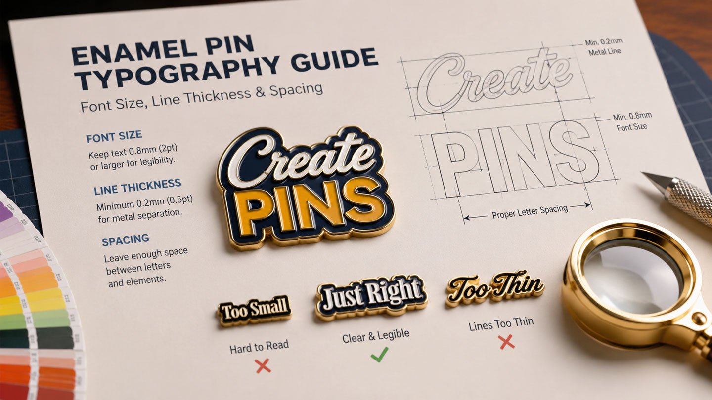
Quick answer: Keep important text around 6 pt or larger, and keep critical metal lines around 0.2 mm (0.008 in) or thicker as a starting guideline for small enamel pin text. These are design guidelines, not universal manufacturing limits — always confirm specifics with your manufacturer’s production tolerances before finalizing complex artwork.
1. Why Is Small Enamel Pin Text Difficult?
Digital artwork and physical enamel pins have very different requirements. On a computer, you can zoom in to 400% and clearly see every tiny detail. A customer holding a 1-inch pin cannot do that — they see the finished object at arm’s length, under normal room lighting, usually for only a second or two.
Every part of your enamel pin lettering has to become a physical feature of the product. Depending on the design, this can involve:
- Raised metal lines
- Recessed enamel areas
- Metal borders
- Small counters inside letters
- Narrow gaps
- Fine details
When these elements become too small, they lose definition or become difficult to manufacture consistently. That’s why designing for physical production is fundamentally different from designing for a screen — a lesson every first-time pin creator eventually learns the hard way if they skip this step.
2. Start With the Final Enamel Pin Size
Before choosing an enamel pin font size, decide how large the finished pin will actually be. If you haven’t settled on dimensions yet, our enamel pin size and thickness guide is a good place to start.
Typical enamel pin sizes include:
0.75″ – 1″
Best for logos, icons, single short words
1.25″ – 1.5″
Comfortable for short phrases, 2 lines of text
1.75″ – 3″
Room for longer phrases, dates, curved text
The smaller the pin, the more carefully you need to control enamel pin typography. For example, a short phrase may work well on a 1-inch pin:
2026 TOUR
But a sentence such as:
THANK YOU FOR SUPPORTING OUR JOURNEY
will probably require a larger pin or a simplified layout.
General rule: the smaller the pin, the less text you should use. If text is a critical part of the design, increasing the pin size can be a much better solution than shrinking the enamel pin font size.
3. What Enamel Pin Font Size Should You Use?
One of the most common questions from new pin designers is: what is the minimum font size for enamel pins? The answer isn’t a fixed number. Font size is measured in typographic units, but different fonts have very different physical proportions — two fonts both set to 6 pt can have completely different letter heights, stroke widths, counters, and overall readability.
For that reason, treat point size as a guideline rather than a guarantee. As a practical starting point:
| Approximate Text Size | Design Guidance |
|---|---|
| 10–12 pt | Generally comfortable for most designs |
| 8–10 pt | Often suitable with clean, simple fonts |
| 6–8 pt | Requires careful testing at actual size |
| Below 6 pt | Higher risk for important, must-read text |
These values are design guidelines, not universal production specifications — the actual result depends on the specific font and the physical dimensions of the small enamel pin text once printed at true size.
4. Measure Letter Height, Not Just Font Size
A more reliable way to evaluate small enamel pin text is to look at the actual physical height of the letters. Lowercase letters can be significantly shorter than uppercase letters set at the same nominal point size. Uppercase lettering such as ABC is generally easier to reproduce cleanly than lowercase lettering such as abc at the identical enamel pin font size.
When preparing artwork, ask yourself: how tall is the smallest important letter in the actual pin design, measured in millimeters at final size? This single question is often more useful than knowing the point size alone.
5. Minimum Line Thickness for Enamel Pins
Stroke thickness is one of the most important production considerations of all. For many custom enamel pin designs, a useful starting guideline is a minimum important line thickness of approximately 0.2 mm (0.008 in). Lines thinner than this can become increasingly difficult to reproduce depending on the design and the manufacturing process used.
Thin strokes can affect:
- Metal definition
- Enamel separation
- Letter readability
- Small internal details
- Production consistency across a batch
The 0.2 mm figure should be treated as a practical guideline, not a universal industry standard. Always confirm your manufacturer’s specific tolerances — see our production expectations and tolerances guide — before finalizing a complex design.
6. Why Thin Fonts Are Risky for Enamel Pin Lettering
Thin fonts can look elegant in digital artwork, but they’re often much less effective on a physical enamel pin. A very light font may contain strokes that appear fine on screen at 100% zoom but become extremely delicate — even fragile — after manufacturing. Small thin strokes can result in poor readability, weak visual definition, loss of detail, crowded enamel areas, and inconsistent production. For small enamel pin text, medium-weight or bold fonts are generally the safer choice.
7. Best Fonts for Small Enamel Pins
There isn’t one universally “best” font, but fonts with clear, relatively simple letterforms consistently perform better at small sizes.
Good choices
Clean sans-serif, bold geometric fonts, simple display fonts, strong block lettering, medium-weight serifs
Use with caution
Hairline fonts, thin serifs, calligraphy, decorative scripts, very condensed fonts
Rule of thumb
The best font is the one that stays recognizable at the pin’s actual physical size
A font that looks beautiful on a poster may not be suitable for a 1-inch pin — always evaluate typefaces at real production size, not on a large monitor.
8. Check the Counters Inside Letters
A counter is the enclosed or partially enclosed space inside a letter — found in letters like A, B, D, O, P, R, a, and e. When text becomes too small, these internal spaces can close up entirely. An A can start to resemble a solid triangle, and a B can lose the visual separation between its upper and lower sections. This is why fonts with sufficiently open counters are generally safer for small enamel pin text.
9. Letter Spacing, Kerning & Line Spacing
Even when individual letters are large enough, text can become unreadable if the letters are packed too closely together. Compare CUSTOMPINS with CUSTOM PINS — the spaced version is far easier to scan at a glance. Avoid squeezing letters together simply to make a phrase fit; instead, increase tracking, shorten the wording, use two lines, increase the pin size, or remove unnecessary words. Give small enamel pin text room to breathe.
Kerning — the space between individual character pairs — matters too. Certain combinations, like AV, WA, To, Yo, and LT, naturally create tight areas that can look elegant at large sizes but cause letters to visually merge at small sizes. Always inspect the entire word, not just individual letters.
When you’re stacking multiple lines (for example, “LIMITED” over “EDITION”), make sure there’s enough vertical separation that the two lines stay visually distinct and the metal boundaries between them don’t feel crowded.
10. Use Fewer Words — and Prioritize What Matters
This is one of the most effective ways to improve small-pin enamel pin typography. Suppose you want to fit this on a 1-inch pin:
OFFICIAL LIMITED EDITION COLLECTOR’S PIN
Instead, consider simply: LIMITED EDITION. You’ve immediately created more room for larger enamel pin lettering, better spacing, stronger visual hierarchy, and cleaner manufacturing. Shorter copy almost always produces better small-pin typography.
Prioritize the most important words
Not every word needs equal emphasis. For a tour pin with “BAND NAME,” “2026 TOUR,” and “LOS ANGELES,” the band name might be the most important element — make it larger, and let the location run smaller. This creates a clear visual hierarchy and prevents the whole design from feeling crowded.
Use abbreviations when appropriate
Abbreviations can save valuable space: “NEW YORK CITY” becomes “NYC,” “LIMITED EDITION” becomes “LE,” and “WORLD TOUR 2026” becomes “WORLD TOUR ’26.” Don’t abbreviate important information if doing so makes it confusing, but when the meaning stays clear, shorter text can significantly improve the design.
11. Curved Text & Script Fonts Require Extra Caution
Circular enamel pins often use text that wraps around the edge, like “CUSTOM ENAMEL PINS • EST. 2009.” Curved text adds extra challenges because the letters follow an arc, rotate at different angles, have limited space, and can appear smaller near the edge. If curved text is important, use a simple font, increase the enamel pin font size, add extra letter spacing, keep the phrase short, and leave enough distance from the edge. For very small pins, straight text is usually easier to read.
Script fonts can be beautiful, but they’re difficult to manufacture at small sizes because they often contain thin strokes, overlapping letters, flourishes, tight connections, and complex curves. If you want a script style, reserve it for a single short word rather than a full sentence — and avoid extremely condensed fonts for the same reasons (narrow counters, tight spacing, thin strokes, crowded letterforms).
12. Use Strong Color Contrast & Metal Borders
Small enamel pin text needs strong visual contrast to stay legible. Black enamel against bright metal creates strong separation, while light yellow enamel against gold metal can be much harder to read. When text is small, high contrast becomes even more important — don’t make small enamel pin text fight against a low-contrast color combination. Our enamel pin color palette guide and plating colors guide can help you plan combinations that stay readable.
One advantage of enamel pins is that raised metal can physically separate enamel areas — metal borders around letters, logos, and symbols can meaningfully improve visual clarity. However, metal borders still need to be large enough for the manufacturing process; a metal line that’s too thin can’t be rescued simply by adding a contrasting color.
13. Soft Enamel vs. Hard Enamel Typography
Typography can look and behave differently depending on the enamel process you choose — see our full hard enamel vs. soft enamel comparison for the complete breakdown.
- Soft enamel pins have recessed enamel areas separated by raised metal borders. The raised metal can provide strong visual definition around small enamel pin text.
- Hard enamel pins are filled and polished to create a smooth, flush surface, giving a clean, premium appearance.
Neither process eliminates the need for production-safe enamel pin typography — a tiny, overly complicated font remains difficult regardless of which enamel type you choose.
14. When Printed Details May Be Better
Traditional enamel filling isn’t always the best solution for extremely small graphic details. Depending on the product, printing or UV printing may be a better fit for very small text, fine graphic details, gradients, detailed illustrations, or small logos. This can be especially useful when the design contains information that would be difficult to reproduce as raised metal and enamel. If tiny text is essential to your design, discuss alternative decoration methods with your manufacturer before production begins.
15. Test Typography at Actual Size — Don’t Trust the Screen
One of the most important design tests is also one of the simplest: view the artwork at the actual physical size of the finished pin. If the pin is 1.25 inches wide, print your design at approximately 1.25 inches wide, then ask yourself:
- Can I read the important words?
- Can I recognize every letter?
- Do the counters remain open?
- Are any letters merging together?
- Is there enough spacing?
- Does the visual hierarchy still work?
A high-resolution monitor can make tiny text appear deceptively good. The physical product introduces metal reflections, enamel surfaces, lighting changes, viewing distance, manufacturing tolerances, and physical texture that a screen simply can’t simulate. Your screen is useful for design — the actual-size physical test is far more useful for judging real-world readability.
If your design depends heavily on small enamel pin text, consider producing a physical sample before a large production run. Learn more about how this works in our sample approval process guide.
16. Convert Text to Outlines Before Submitting Artwork
If you’re submitting vector artwork, converting fonts to outlines is generally recommended — in Adobe Illustrator, this is Type → Create Outlines. This changes editable text into vector shapes and helps prevent problems caused by missing fonts, font substitution, different font versions, and software compatibility issues between your computer and the manufacturer’s team. For more on preparing files correctly, see our best file formats guide (AI vs. PSD vs. PNG).
Keep your original editable artwork separate from your outlined production file, and save a master folder for every pin design containing the original editable artwork, outlined production artwork, final approved proof, font information, color specifications, pin dimensions, plating information, backing specifications, and production notes. This makes future reorders and design updates far easier.
Also watch small punctuation — periods, commas, apostrophes, hyphens, colons, and ampersands can disappear surprisingly easily at tiny sizes. For example, “EST. 2009” may be less readable than “EST 2009.” If punctuation isn’t essential to the design, removing it can free up valuable space. The same applies to numbers and dates: double-check easily confused characters like 6 vs. 8, 3 vs. 8, 1 vs. 7, and 0 vs. O, and give important numbers enough room to stay clear.
17. Production-Safe Typography Checklist
Before approving your enamel pin artwork, run through this checklist:
- Final pin size is defined
- Important text is large enough (6 pt or larger as a guideline for small enamel pin text)
- Critical lines are approximately 0.2 mm (0.008 in) or thicker
- Small counters remain open
- Letter spacing is sufficient
- Line spacing is sufficient
- Font weight is not excessively thin
- The font isn’t unnecessarily complicated for enamel pin lettering
- Text has strong color contrast
- Long phrases have been shortened where possible
- Curved text has been tested
- Tiny punctuation has been checked
- Important numbers are readable
- Production text has been converted to outlines
- Editable master artwork has been saved
- Artwork has been viewed at 100% physical size
- A physical sample has been considered for complex designs
- The final production proof has been reviewed
For a deeper checklist of the mistakes that most often delay production, see the biggest enamel pin design mistakes to avoid.
18. Example: Fixing a Crowded Small Pin
Imagine a 1-inch pin containing the phrase “OFFICIAL 2026 WORLD TOUR LIMITED COLLECTOR EDITION.” It’s technically possible to fit this text on the canvas, but it will be extremely small. Instead, consider simplifying:
Option 1
2026 TOUR
Option 2
WORLD TOUR
2026
Option 3
BAND NAME
2026
Each version gives the enamel pin typography more room to breathe. Option 3 may communicate the most valuable information while keeping the design simple, readable, and production-friendly.
A simple formula for better small-pin typography
Smaller pin → less text → larger letters → thicker strokes → more spacing → better readability. This sequence is far more reliable than trying to squeeze everything into a tiny area, and it applies whether you’re designing your first pin or your fiftieth.
What to tell your pin manufacturer
If enamel pin typography is particularly important, say so before production. For example: “the wording must remain clearly readable,” “the date is essential and cannot be removed,” or “please flag any text that may be too small for production.” This gives the production team the chance to catch potential issues before your order goes into manufacturing. Learn more about what happens after you submit artwork in our order process guide.
Frequently Asked Questions
What is the minimum font size for an enamel pin?
There’s no single universal minimum, because 6 pt text looks completely different from font to font. As a practical starting point, keep important text around 6 pt or larger, and always evaluate the actual physical letter height rather than relying on point size alone.
How thick should lines be on an enamel pin design?
A useful starting guideline is to keep important metal lines around 0.2 mm (0.008 inch) or thicker. This is a design guideline rather than a fixed manufacturing rule, so confirm exact tolerances with your manufacturer for complex or highly detailed artwork.
Can I use script or cursive fonts on small enamel pins?
Script fonts are risky at small sizes because they often contain thin strokes, tight connections, and overlapping letterforms. If you want a script style, use it for a single short word rather than a full sentence, and test it at actual pin size before production.
Should I convert my text to outlines before sending artwork?
Yes. Converting text to outlines (Type → Create Outlines in Illustrator) turns editable text into vector shapes, which prevents issues caused by missing fonts, font substitution, or software differences between your files and your manufacturer’s production team.
What’s the best way to fit a long phrase on a small pin?
Shorten the wording, use abbreviations where the meaning stays clear, break the phrase across two lines, prioritize the most important words with a larger size, or increase the overall pin size. Squeezing text tighter to make it fit is the least reliable option.
Does soft enamel or hard enamel handle small text better?
Both can handle small enamel pin text reasonably well, but neither eliminates the need for production-safe enamel pin typography. Soft enamel’s raised metal borders can add visual definition, while hard enamel gives a smooth, polished finish — the font choice and stroke thickness matter more than the enamel type itself.
Should I get a physical sample before ordering a large batch?
If your design relies heavily on small enamel pin text, unusual fonts, curved lettering, or detailed logos, a physical sample is strongly recommended. It lets you judge real-world readability under actual lighting and materials rather than relying only on a digital mockup.
Not Sure If Your Text Will Print Clearly?
Send us your artwork and we’ll flag any text, lines, or details that may be too small for production — before you commit to a full run.
The biggest mistake when designing small enamel pin text is designing for the screen instead of the physical product. Your customers won’t see the artwork at 800% zoom — they’ll see a small metal and enamel object in their hand. Use readable fonts, keep important strokes sufficiently thick, give letters room to breathe, use strong contrast, remove unnecessary words, and always test the design at actual size. The goal isn’t to fit as much text as possible — it’s to make the right text readable. A simple, well-spaced phrase on a small enamel pin will almost always outperform a crowded design packed with tiny enamel pin lettering.