How to Prepare Perfect Artwork for Custom Keychains (By Material & Type)
Creativity gets your design started. Correct artwork preparation gets it produced accurately. Here’s every rule you need — universal guidelines first, then material-by-material specifics.
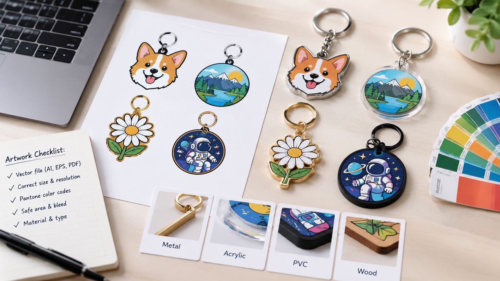
Designing custom keychains that look clean, professional, and production-ready isn’t just about creativity — it’s about preparing your artwork correctly for the specific material you’re ordering.
Different keychain types require fundamentally different artwork approaches. A file that works perfectly for an acrylic keychain will fail completely for PVC. A design that looks beautiful on screen may require significant adjustment before it can be manufactured. This guide covers every rule you need — starting with the fundamentals that apply to all keychains, then diving into the specific requirements for each material type.
Your file format is the foundation of everything. The wrong format forces manufacturers to work around technical limitations — and the result is almost always a compromise in quality.
- Sharp edges at any scale — no pixelation
- Manufacturers can measure exact line weights
- Easier to make production adjustments without quality loss
- Required for PVC, enamel, and metal keychains
- Pixel-based — loses quality when scaled
- Line weights can’t be precisely measured or adjusted
- Cannot be used for molded or enamel production
- Only suitable for printed keychains (acrylic, epoxy)
Fine lines and tiny details disappear in production — not because manufacturers miss them, but because physical production processes have real minimum thresholds for what they can hold.
If your design details disappear or blur when you zoom your screen out to actual keychain size (typically 2–3 inches on your monitor), they will not survive production. This single check prevents the majority of first-order disappointments.
Color specification varies significantly between printed and molded keychain types. Using the wrong color system for your product type leads to inaccurate reproduction that surprises most first-time buyers.
- Acrylic / epoxy (printed): CMYK color mode at 300 DPI
- Metal enamel: Pantone PMS codes for every color
- PVC: Solid vector colors, reference Pantone where possible
- Gradients: acrylic and epoxy only — not for PVC or enamel
- Submitting RGB colors for any physical product (screen ≠ print)
- Using gradients in PVC or enamel designs (physically impossible)
- Fragmented or overly similar adjacent colors that blur together
- No Pantone reference — manufacturer interprets your color
Always convert text to outlines (also called “paths” or “curves”) before submitting your file. This eliminates font dependency entirely — the manufacturer sees shapes, not characters that require a specific font installation to display correctly.
Un-outlined text is one of the most common causes of artwork errors. When a manufacturer opens your file without the correct font installed, their system substitutes a default font — and your carefully chosen typography changes completely, often without anyone noticing until after production.
Most designers work at 100% screen zoom — which is often 3–5× larger than the actual keychain. Always step back and evaluate your design at actual physical size before submitting. What looks great at full screen can be illegible at 2 inches.
Print your design at actual size on paper and pin it to your jacket or bag. View it from 2–3 feet away — the typical distance at which someone would notice a keychain. This real-world test catches legibility issues that no digital preview can reveal.
For printed keychains (acrylic, epoxy, transparent), bleed prevents white or unintended borders from appearing after the cutting step. Your background artwork needs to extend beyond where the cutter will cut.
Well-organized files speed up production, reduce errors, and make revision rounds faster. A messy, unlabeled file requires manufacturers to interpret your intentions — and those interpretations may not match yours.
- Layer 1: Cut line / outline (clearly labeled)
- Layer 2: Colors / fills (one layer per major color area if helpful)
- Layer 3: Text (already outlined)
- Layer 4: Special effects — glitter zones, epoxy areas, transparent sections
Clear layer organization shows manufacturers you understand the production process — and it almost always results in faster proofing turnaround and fewer back-and-forth revision requests.
If your design includes any special effects, communicate them clearly and explicitly — don’t expect the manufacturer to interpret ambiguous areas correctly. Use separate labeled layers, callout notes in the file, and written confirmation in your order notes.
The clearest approach: mark each special effect area on a separate labeled layer with a descriptive name — “GLITTER ZONE”, “TRANSPARENT”, “EPOXY COVERAGE AREA”. This removes all ambiguity from the production instruction set.
Not sure if your artwork is production-ready? Our team reviews every file and flags issues before your order begins — completely free.
Submit My Artwork for Free Review →Acrylic is the most design-flexible keychain material — it’s printed digitally, meaning your artwork reproduces almost exactly as designed. Gradients, fine detail, photographic imagery, and complex color arrangements all work beautifully. The main constraints are bleed, safe margins, and color mode accuracy.
PVC keychains are injection-molded — each color is a separate physical layer of rubber. This means gradients are physically impossible and fine details don’t hold well in the mold. Bold, simple designs with clearly separated solid color areas translate best. Think of it like designing for screen printing: each color is a flat, solid layer with hard edges.
Enamel keychains share the same production fundamentals as enamel pins — raised metal lines (from the die mold) separate each color area, which is filled individually with enamel. Every color area must be completely enclosed by metal lines. Think of the design like stained glass: every pane of color needs a complete frame. Pantone codes are essential because the manufacturer mixes physical enamel pigments to match your specification.
If your design requires gradients in a metal keychain, ask about screen printing or UV printing as an add-on over the base metal — this significantly expands color capability while retaining the premium metal feel and weight.
Epoxy dome keychains use a printed base (similar to acrylic) covered by a clear resin dome layer that adds thickness, protection, and a premium glass-like appearance. The epoxy layer slightly softens very fine details — so designs with clean, high-contrast elements reproduce better than ultra-thin-line artwork.
Glitter enamel is mixed into the fill material and applied to defined zones. It works best in large, clearly delineated areas — backgrounds, border fills, and bold accent sections. Glitter in tiny or thin areas loses visual impact and may cause production difficulties. Note that glitter can subtly shift the perceived tone of the base color — black enamel, for example, can appear slightly greenish with certain glitter types.
Transparent keychains are made from clear acrylic — printed areas appear opaque; unmarked areas allow the background to show through, creating the “floating” design effect. This is achieved by applying a white base layer only under the areas you want opaque. Without a white base layer, all printed colors appear washed-out and translucent.
Double-sided keychains require careful file preparation because the alignment between front and back artwork must be intentional and clearly specified. Provide completely separate, clearly labeled files for each side. If you want the back to be a mirror of the front, say so explicitly in writing — never assume the manufacturer will mirror it automatically.
Shaker keychains have a sealed cavity between two acrylic layers filled with loose moving elements — confetti, small shapes, glitter, tiny figures — that move when shaken. They require a completely different file structure from standard keychains. You’re designing three distinct components that must be coordinated: the base layer, the floating internal elements, and the clear top cover.
| Type | Gradients? | Detail Level | File Type | Design Style |
|---|---|---|---|---|
| Acrylic | ✅ Yes | High | Raster / Vector | Detailed, colorful |
| PVC Rubber | ❌ No | Low | Vector only | Bold, solid colors |
| Metal Enamel | ❌ No | Medium | Vector only | Clean, structured |
| Epoxy Dome | ✅ Yes | Medium | Raster / Vector | Glossy, vibrant |
| Glitter | ❌ No | Low | Vector only | Accent areas |
| Transparent | ✅ Yes | Medium | Raster / Vector | Minimalist, floating |
| Double-Sided | ✅ Yes | High | Layered files | Two-face design |
| Shaker | ✅ Yes | Medium | Layered files | Interactive, fun |
✅ The secret to perfect custom keychains: match your artwork style to your material. Forcing a complex gradient-heavy design into PVC — or using ultra-fine details for enamel — always leads to compromises. Choose your material first based on your design’s visual language, then prepare your artwork to fit that material’s production requirements.
Why Work with CreatePins?
Ready to Create Your Custom Keychains?
Submit your design and our team will review your artwork, flag any production issues, and deliver a transparent quote — for free, before your order begins.
Frequently Asked Questions
Vector files (AI, EPS, SVG) are the gold standard for most keychain types — especially PVC, metal enamel, and any molded or laser-cut product. They ensure sharp edges at any scale and allow manufacturers to measure exact line weights. For printed keychains like acrylic, raster files (PNG, PSD) are acceptable at a minimum of 300 DPI at actual production size. Never submit a raster file for PVC or enamel keychain production.
It depends on the keychain type. Gradients work well for printed keychains — acrylic, epoxy dome, transparent, and shaker styles all use digital printing where gradients reproduce accurately. Gradients cannot be reproduced in PVC, metal enamel (soft or hard), or glitter keychains — these use solid color fills separated by physical borders. If your design requires gradients, acrylic with digital printing is the appropriate material choice.
Maintain a minimum line thickness of 0.3–0.5mm for most keychain types. For PVC rubber keychains, 0.5mm minimum is recommended because the injection molding process requires slightly more material to hold shape reliably. For metal enamel keychains, 0.3–0.4mm is the production minimum. Lines below these thresholds may collapse, disappear, or fail to hold enamel properly during production.
Bleed is required for printed keychains like acrylic, epoxy, and transparent styles — add 2–3mm of bleed beyond your cut line, and keep important design elements at least 2mm inside the cut edge. Molded products like PVC and metal enamel don’t require traditional bleed in the same way, but you should still avoid placing critical elements too close to the outer boundary of your design.
Yes — always convert all text to outlines before submitting. This ensures your fonts appear exactly as designed even if the manufacturer doesn’t have the same fonts installed. In Adobe Illustrator: select all text, then go to Type → Create Outlines. In Affinity Designer: use Text → Convert to Curves. Un-outlined text is one of the most common causes of font substitution errors that change artwork appearance after submission.
Provide separate, clearly labeled files for the front and back designs. If the back is a mirror of the front, specify this explicitly in writing rather than assuming the manufacturer will mirror it automatically. Align your designs so they register correctly front-to-back, keep critical elements away from the very edge, and always request a proof showing both sides before approving a full production run.
References & Further Reading
- CreatePins — Why Acrylic Keychains Are So Popular Right Now
- CreatePins — UV Printing vs Screen Printing for Custom Keychains
- CreatePins — How Much Do Custom Keychains Cost in 2026?
- CreatePins — How to Choose Durable Metal Keychain Finishes
- CreatePins — Custom Keychains for Events & Giveaways
- CreatePins — Best File Formats for Custom Products (AI vs PSD vs PNG)
- CreatePins — Best Color Guide: Pantone vs CMYK for Custom Merchandise