Why Enamel Pin Colors Look Slightly Different From Your Screen Mockup?
The real reasons enamel pin colors differ from your screen design — and exactly what to do about it
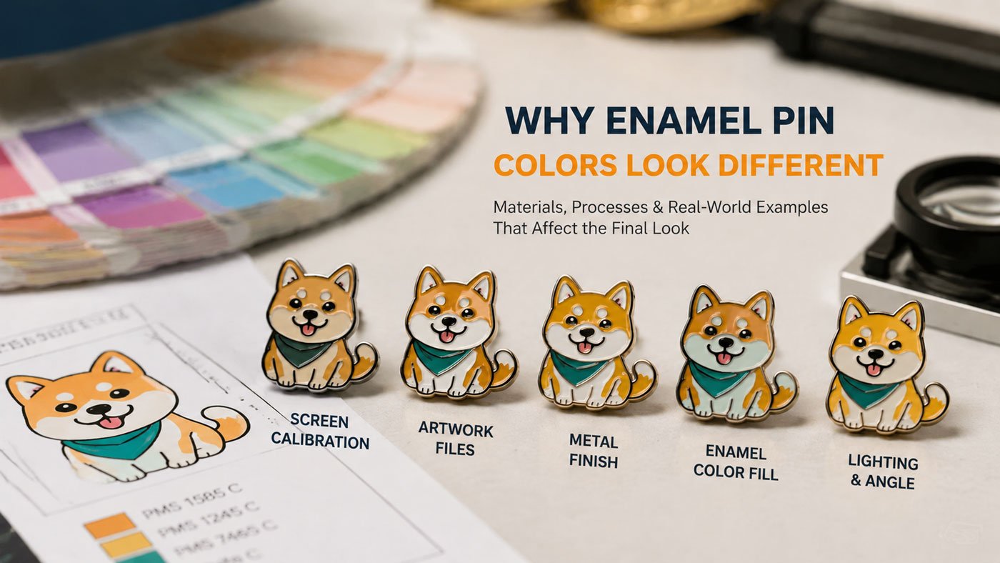
One of the most common questions in custom pin production is: “Why doesn’t the color on my enamel pin match my design exactly?”
If you’ve ever received your pins and noticed the colors look slightly different from your screen mockup, you’re in very good company. Color variation is a normal and expected part of the manufacturing process — not a production error. Understanding exactly why it happens helps you design smarter, set realistic expectations, and ultimately achieve results you’re genuinely proud of.
🎨 The Short Answer
Colors look different on enamel pins because digital screens, physical pigments, and manufacturing processes all display and reproduce color through fundamentally different mechanisms — and these mechanisms cannot produce identical results.
7 Reasons Enamel Pin Colors Look Different
Screen Colors vs Real-Life Colors
When you design a pin, you’re looking at it on a screen that uses the RGB color model — a light-based system that creates color by mixing red, green, and blue light at varying intensities. This produces colors that are inherently brighter, more saturated, and more vivid than any physical material can reproduce.
Enamel pins are made using physical pigments — materials that reflect light rather than emit it. Physical pigments simply cannot achieve the luminosity that screen-based RGB colors create.
Light-based · Vivid · Saturated · 16 million+ colors
Pigment-based · More muted · Standardized · Physical limits
This means neon colors, fluorescent tones, and highly saturated hues that look stunning on screen will appear noticeably more muted in physical enamel. This isn’t a quality issue — it’s a fundamental difference between light and pigment.
Pantone Matching Limitations
Most enamel pin manufacturers use the Pantone Solid Coated (PMS) system to match colors — a standardized set of physical color chips used across the printing and manufacturing industry. When you specify a Pantone code, your manufacturer mixes enamel pigments to match that physical reference chip.
The limitations are real but manageable:
- The Pantone Solid Coated system has a finite number of colors — some digital colors have no exact physical Pantone equivalent, and a close match is used instead
- Even with a confirmed Pantone code, slight variation of ±5–10% from the reference chip is normal due to pigment mixing consistency, fill thickness, and firing temperature
- Pantone colors are matched to physical chips, not screens — your monitor’s rendering of a Pantone code is an approximation, not the actual color
Always specify Pantone Solid Coated (PMS) codes in your design files — never RGB, HEX, or CMYK values. RGB and HEX are screen-based references that have no reliable physical manufacturing equivalent.
Metal Base Plating Affects Color Appearance
The metal plating beneath your enamel — gold, silver, black nickel, copper, antique finishes — acts as the visual canvas for your colors. The plating color shows through lighter, translucent, and pastel enamel areas, and even influences how opaque colors are perceived by affecting the reflected light environment around each fill zone.
Gold Plating
Warms up colors with a slightly amber-tinted quality. Best paired with warm palettes.
Silver / Nickel
Keeps colors more neutral and cool. Ideal for modern, contemporary designs.
Black Nickel
Makes colors appear darker and deeper. Creates high-contrast, dramatic effects.
This plating effect is most pronounced with light pastel colors and translucent enamels — which allow the most underlying metal to visually influence the fill. Dark, saturated colors are less affected.
Soft Enamel vs Hard Enamel — Different Color Perception
The type of enamel production changes how colors physically appear, because the surface structure determines how light interacts with the filled areas.
Soft Enamel
Textured · Dimensional- Recessed enamel creates texture and shadow
- Colors appear slightly darker and richer
- Raised metal lines catch light differently
- More visual depth and character
Hard Enamel
Smooth · Polished- Polished flat surface maximizes light reflection
- Colors appear brighter and cleaner
- More accurate Pantone representation
- Closer to the reference chip appearance
If color accuracy is a priority, hard enamel typically provides better Pantone reproduction because the uniform polished surface creates consistent, predictable light reflection across the entire fill area.
Lighting Conditions Change Everything
A pin that looks one way in product photography may look completely different when worn outdoors, or in a warmly lit room. Lighting profoundly affects color perception for all physical objects — and metal-plated enamel pins are particularly sensitive because their reflective surface responds dramatically to ambient light color temperature.
Warm Indoor Light
Adds yellowish tones · Colors appear warmer · Gold plating reads richer
Cool White Light
Adds bluish tones · Colors appear cooler · Silver plating reads cleaner
Natural Daylight
Most accurate rendering · Neutral temperature · Best for color evaluation
This is why pins can look noticeably different in professional product photos compared to how they appear in hand. It’s also why sample evaluation should always be done under neutral natural daylight conditions — not indoor lighting.
Small Size Creates Big Perceptual Effects
Enamel pins are small objects — typically 1.0 to 2.5 inches. At this scale, the physical size of each color area directly affects how colors are perceived, in ways that don’t show up in a screen mockup:
- Simultaneous contrast: Colors placed next to each other mutually influence each other’s perceived hue and brightness — a yellow next to orange looks different than the same yellow next to blue
- Area effect: Very small enamel fills can appear slightly darker or lighter than larger fills of the same Pantone color, because the amount of light reflected changes with the fill area’s size
- Fine detail compression: Thin lines and small fills that appear distinct on screen can merge or shift in visual weight at physical pin scale
Manufacturing Tolerances Are Normal
Even with precise systems and experienced artisans, enamel pin production involves inherently variable physical processes: mixing pigments by hand or machine, filling individual color areas, and heat-curing at controlled but not perfectly uniform temperatures.
- Enamel pigment mixing introduces small batch-to-batch variation
- Fill depth variation (even within a single pin) changes perceived color saturation
- Kiln temperature gradients during baking create minor, normal color variation
- A ±5–10% visual variation from Pantone reference is considered the accepted industry standard
A ±5–10% visual color variation from the specified Pantone reference is accepted as normal across all professional enamel pin manufacturers worldwide. This is not a defect — it reflects the handcrafted nature of the product.
🎨 Worried about your colors? Submit your design for a free review — our team flags risky color choices and suggests better Pantone matches before production begins.
Get a Free Design ReviewHow to Get the Best Color Results
Apply these six practices and you’ll consistently achieve color results that look excellent in real life — even if they can’t be a perfect replica of your screen design.
Use Pantone Solid Coated Codes
Design using PMS Solid Coated references from the start — never RGB or HEX. Verify colors using a physical Pantone swatch book, not your monitor.
Avoid Neon & Ultra-Saturated Colors
If it glows on screen, it likely won’t translate to enamel. Neon and fluorescent tones have no reliable physical pigment equivalent — they will always appear more muted.
Request a Pre-Production Sample
This is the single most important step for color accuracy. A physical sample lets you evaluate real color before committing your full order to production.
Choose Metal Plating Strategically
Warm palette → gold plating · Cool palette → silver · High contrast → black nickel. Match your plating to your color story from the design stage.
Simplify & Enlarge Color Areas
Larger, cleaner color blocks produce more consistent, accurate results. Avoid very small isolated fill areas that may shift in tone at pin scale.
Work with Experienced Manufacturers
An experienced team flags risky color choices, suggests better Pantone matches, and adjusts designs for manufacturability before the mold is created.
💡 Pro Tip for Designers
- Compare your Pantone references against physical Pantone swatch chips — never against a monitor display of that number
- Ask your manufacturer for photos and videos of production samples under neutral daylight conditions — not studio lighting
- Allow a realistic ±5–10% visual tolerance in your expectations before approving production
- If brand color accuracy is critical (e.g., corporate logos), consider requesting a colorimetry-verified sample before the full run
- Hard enamel is typically better for color accuracy than soft enamel if Pantone fidelity is your primary concern
🎯 Color differences in enamel pins aren’t mistakes — they’re the natural result of transitioning from digital light to physical pigment. By understanding these factors and designing for them, you consistently achieve results that look genuinely excellent in real life — even if they’re not a pixel-perfect replica of your screen design.
Get Colors You’ll Love in Real Life
Our team reviews your design for color risks, suggests optimal Pantone matches, and helps you choose the right plating combination — all free before production begins.
Start Your Free Quote & Review →Free Pantone review · Pre-production sample available · Expert color guidance
Frequently Asked Questions
Common questions about enamel pin color differences and how to manage them.
Colors look different because screens use RGB light-based color that is inherently more vivid than physical enamel pigments. Additionally, the metal plating beneath the enamel influences color appearance, the type of enamel (soft vs hard) changes light reflection, and lighting conditions dramatically affect perceived color. These are structural differences between digital and physical color systems — not production errors.
Pantone Solid Coated (PMS) is the standardized physical color system used in enamel pin manufacturing. Because physical enamel pigments cannot reproduce screen RGB or CMYK colors accurately, manufacturers use Pantone references to mix and verify color. Even with correct Pantone codes, a ±5–10% variation from the reference is normal due to pigment mixing, firing temperature, and fill depth. Always specify Pantone Solid Coated codes — never RGB or HEX values.
Yes — significantly, especially for lighter and translucent colors. Gold plating warms up colors with an amber-tinted quality. Silver plating keeps colors more neutral. Black nickel makes colors appear darker and deeper. This effect is most pronounced with pastels and translucent enamels that allow the underlying metal to visually influence the fill. Choose your plating to complement your color palette from the design stage.
Soft enamel has recessed areas with raised metal lines — the texture creates shadows that make colors appear slightly darker and richer. Hard enamel is polished flat, creating a smooth reflective surface where colors appear brighter and closer to the Pantone reference. If color accuracy is your priority, hard enamel typically provides better Pantone fidelity due to its uniform, controlled surface.
For best color accuracy: specify Pantone Solid Coated (PMS) codes for every enamel fill; avoid neon and highly saturated colors that have no physical equivalent; choose metal plating that complements your palette; request a pre-production physical sample and evaluate it under neutral daylight; allow a realistic ±5–10% tolerance. Hard enamel is generally more accurate than soft enamel if Pantone fidelity is critical.
References & Further Reading
- CreatePins — How to Choose Enamel Pin Colors: A Complete Color Palette Guide
- CreatePins — Custom Enamel Pin Production Expectations & Tolerances
- CreatePins — Complete Enamel Pin Design Guide (2026)
- CreatePins — The Beginner’s Guide to Enamel Pin Plating Colors
- CreatePins — How to Order Enamel Pins (Step-by-Step Guide)
- CreatePins — Technical Tips for Enamel Pin Design (Beginner Guide)
- CreatePins — The Biggest Enamel Pin Design Mistakes That Ruin Everything
- CreatePins — Translucent Enamel Pin Design Guide
- CreatePins — Best File Formats for Custom Enamel Pins (AI vs PSD vs PNG)
- CreatePins — How to Choose the Perfect Size & Thickness for Your Enamel Pin Design
- CreatePins — Want More Than Just Custom Pins?