Why Can’t My Enamel Pin Design Be Manufactured? 15 Common Reasons
A complete, detailed breakdown of the enamel pin design problems, enamel pin design requirements, and enamel pin manufacturing limitations behind almost every “please simplify this artwork” request — and exactly what to change.
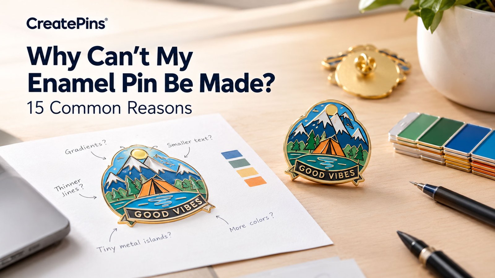
You have a great enamel pin design. The artwork looks perfect on your screen, the colors are exactly right, and every tiny detail feels important. Then your manufacturer says: “This design needs to be simplified before we can manufacture it.” Or maybe: “the lines are too thin,” “the text is too small,” “we can’t reproduce that gradient,” or “please provide a vector file.” If something displays perfectly on a computer, why can’t my enamel pin be made exactly the same way? The short answer is that digital artwork and manufactured metal products follow very different rules — and understanding those rules is the fastest way to stop running into the same enamel pin design problems order after order.
This guide walks through all 15 common enamel pin manufacturing limitations we see at CreatePins, why each one exists, and exactly what to change so your next design sails through production the first time.
Why Can’t My Enamel Pin Be Made?
Almost every rejection comes down to one root cause: the artwork contains details that can’t be reliably reproduced at the pin’s physical size. A design that looks excellent at 100% zoom on a monitor can become extremely difficult to manufacture once it’s reduced to a 1-inch or 1.25-inch metal object. Manufacturing has real physical limits around minimum line width, minimum gaps, small text, tiny enclosed areas, isolated metal sections, color count, surface finishing, and production tolerances. This doesn’t necessarily mean a full redesign — in most cases, meeting a handful of enamel pin artwork requirements through small, targeted adjustments is enough.
15 Reasons an Enamel Pin Design Can Be Difficult to Manufacture
Each of the following enamel pin manufacturing limitations shows up again and again in engineering review, and each one has a simple, practical fix.
1Lines That Are Too Thin
Thin linework is the single most common of all enamel pin design problems, and it’s usually the first enamel pin design requirement people miss. An outline that’s only a few pixels wide looks sharp on a monitor, but the metal outline of a physical pin has to actually exist — and very thin metal sections can become weak, difficult to form, difficult to polish, and visually inconsistent.
2Not Enough Space Between Details
It’s not just thin lines — tiny gaps cause the same problem. Two metal lines separated by a microscopic gap can visually merge into one during manufacturing, since the gap becomes too small to reproduce consistently. The smaller the pin, the more this matters.
3The Pin Is Too Small for the Amount of Detail
A highly detailed character illustration might look fantastic at 3,000×3,000 pixels, but reduced to a 0.75-inch pin, hundreds of tiny details simply have nowhere to go. This is one of the enamel pin manufacturing limitations that’s really a size mismatch rather than an artwork flaw.
4Gradients Can’t Be Reproduced Like a Digital Image
A computer can display millions of intermediate shades in a smooth blue-to-pink gradient. Traditional enamel filling works differently — enamel sits in defined metal sections, each holding one particular color, not a continuously changing range. That’s a hard physical limit, not a stylistic preference.
5Text That’s Too Small
A font can look perfectly readable at 100% zoom and still become unreadable once reduced to a 1-inch metal pin. Small text becomes difficult to mold, difficult to fill, and easily blurred — especially with thin, serif, condensed, or handwritten fonts, or lettering placed along a curved edge.
6Metal Lines Need to Be Thicker
A physical metal line isn’t a pixel — it needs enough width to survive die striking, plating, polishing, enamel filling, cleaning, and inspection while staying visually clean. Very thin metal sections can come out looking heavier or less defined after finishing than they appeared in the original file.
7Tiny Metal Islands Are Difficult to Manufacture
A “metal island” is a small isolated section of metal fully surrounded by enamel — like a tiny floating dot inside a blue area. Physically, that island needs to stay attached or properly supported; if it’s too small or isolated, it can be structurally weak, hard to align, or too fragile for consistent production.
8Too Many Tiny Enamel Sections
An intricate illustration with 20 tiny highlights, 30 tiny shadows, and dozens of micro-details might look great digitally, but each enamel color area needs to be physically defined — and that many tiny sections quickly become too small for reliable enamel filling.
9Overlapping Elements That Are Too Close Together
Overlapping outlines, shadows, highlights, and decorative effects are common in digital illustration, but once converted into a metal die, elements with only a tiny space between them can effectively merge — especially in character artwork and detailed logos.
10Photographic or Extremely Detailed Artwork
Enamel pins excel at logos, icons, bold illustrations, and graphic designs — they’re not naturally suited to reproducing photographic detail, which can include thousands of subtle shadows, highlights, color transitions, and skin tones that would require an impractical number of physical sections.
11Too Many Colors for the Manufacturing Method
There’s no universal color limit, but every additional color adds complexity — each area must be defined, separated, filled, and inspected individually. Dozens of tiny colors usually trigger a request to reduce the palette.
12Extremely Precise Color Placement
Even when individual colors are all achievable, the boundaries between them can be a problem — for example, red, blue, and yellow all meeting at one tiny central point. Manufacturing tolerances mean small variations can appear right at that intersection.
13Polishing Can Affect Extremely Small Metal Details
Polishing is essential for a clean finished pin, but it can subtly change hairline metal borders, tiny text, narrow metal channels, and very small raised details. A detail that looks perfect right after the metal is formed can look different once plating and polishing are complete.
14Raster Artwork Instead of Vector
JPGs, PNGs, screenshots, and AI-generated images are all fine as references, but manufacturing a metal die generally requires vector artwork — clearly defined shapes, paths, and boundaries, in formats like AI, EPS, SVG, or a vector PDF. A PNG can tell a manufacturer “this area looks blue”; a vector file can specify “this exact enclosed shape should be filled with blue” — a meaningful difference at the die-making stage.
15The Design Doesn’t Match the Manufacturing Technique
Not every artwork suits the same production method. Soft enamel excels at recessed color and bold graphic designs; hard enamel suits smooth, premium, refined artwork; UV printing handles gradients and fine text; screen printing covers certain graphic details; 3D relief adds sculpted, raised dimension. Sometimes the fix isn’t “change the design” — it’s “change the production method.”
How Manufacturers Decide Whether a Design Is Manufacturable
Understanding why can’t my enamel pin be made a certain way often comes down to how a manufacturer actually evaluates a file. A professional manufacturer isn’t just asking “does this look good?” — they’re asking “can this be reproduced consistently as a physical product?” The evaluation usually covers:
Overall Pin Size
A 2-inch pin accommodates far more detail than a 0.75-inch pin.
Line Thickness
Are the metal lines strong and visible enough to survive finishing?
Negative Space
Are there sufficient gaps between elements?
Text Size
Will the lettering remain readable at final scale?
Metal Structure
Are there tiny isolated metal sections or islands?
Color Areas
Can the enamel be filled cleanly and consistently?
Surface Finish
Will polishing affect small or delicate details?
Production Technique
Would soft enamel, hard enamel, printing, or a hybrid work best?
Artwork Format
Can the design be converted accurately into production paths?
Final Appearance
Will the finished pin still look like the original design?
Every one of these checks maps back to specific enamel pin design requirements — size, line thickness, spacing, text, structure, color, finish, technique, and format all have to line up before a die gets cut.
Why Manufacturers Sometimes Simplify Your Design
Simplification isn’t a sign your manufacturer dislikes your artwork — it’s often meant to protect it. If a detailed illustration contains 100 tiny elements and a manufacturer tries to reproduce every single one exactly, the finished pin can end up looking muddy, crowded, or uneven. Removing 10–20 unnecessary micro-details can actually make the finished pin look more like the original artwork once it’s viewed at its intended physical size. Good simplification isn’t about making the artwork worse — it’s about deciding which details are important enough to survive manufacturing.
How to Make Your Enamel Pin Design More Manufacturable
Meeting these core enamel pin design requirements before you submit artwork will resolve the vast majority of manufacturing objections. Think of this list as the baseline enamel pin artwork requirements almost every manufacturer checks for:
- Choose a pin size appropriate for your level of detail
- Keep important metal lines around 0.2mm or thicker
- Avoid microscopic gaps — give elements room to breathe
- Make text readable at final size, not just on screen
- Simplify unnecessary details, keeping what defines the artwork’s identity
- Avoid traditional enamel gradients unless paired with printing
- Avoid tiny isolated metal islands — connect, enlarge, or remove them
- Provide vector artwork (AI, EPS, SVG, or vector PDF) when possible
- Tell your manufacturer which details matter most
Our file formats guide and typography guide go deeper on two of the most common enamel pin artwork requirements: correct file type and readable text.
What If My Design Is Very Detailed?
Don’t assume a detailed concept can’t become a pin. There are usually several ways forward:
1. Increase the Pin Size
More physical space means more room for legitimate detail.
2. Simplify the Artwork
Remove details that don’t meaningfully contribute to the overall look.
3. Change the Production Technique
Hard enamel, soft enamel, UV printing, or screen printing may suit the artwork better.
4. Combine Techniques
Enamel can provide structure while printing handles fine details or gradients.
5. Create a Production Mockup
See how the design translates before committing to a full production run.
Our best online tools for pin design mockups guide is a good starting point for testing a detailed concept before you submit final files. If your source artwork came from an AI generator, our guides on turning AI art into manufacturable enamel pins and common AI enamel pin mistakes cover the specific cleanup that AI concepts usually need.
A Screen Is Not the Same as a Pin
This is the single most important concept behind every one of these enamel pin manufacturing limitations. A monitor can display tiny lines, millions of colors, smooth gradients, microscopic text, and perfect curves. A physical enamel pin cannot — it’s a combination of metal, enamel, plating, polishing, physical tolerances, and both human and machine production steps. Successful pin design means thinking in terms of physical manufacturing, not just digital artwork.
Your artwork doesn’t have to be simple to become a great enamel pin. It just needs to be designed — or adapted — for the physical manufacturing process.
Final Takeaway: Manufacturability Is Part of Good Pin Design
A design that looks perfect digitally isn’t automatically ready for physical production. The best enamel pin designs balance artistic detail with manufacturing reality. When a manufacturer recommends thicker lines, larger text, more spacing, fewer tiny details, vector artwork, fewer enamel sections, a larger pin size, or a different production technique, the goal is to make the finished product look better — not to change your artwork unnecessarily. If you’re ever asking “why can’t my enamel pin be made” the way you imagined it, the best move is to have the design reviewed before production, so any enamel pin design problems get caught on a proof instead of after a full run.
Frequently Asked Questions
Why can’t my enamel pin be made exactly as designed?
Usually the artwork contains details that are too small, too thin, too close together, structurally difficult, or incompatible with the chosen manufacturing technique. Simplifying the artwork, increasing the pin size, adjusting lines and gaps, or switching production methods usually solves it.
Why does my manufacturer want to simplify my design?
Because some digital details won’t reproduce clearly at the pin’s physical size. Removing unnecessary micro-details can actually make the final pin look closer to the original artwork, not further from it.
Why can’t I use gradients on an enamel pin?
Traditional enamel filling uses separate, defined color areas rather than the continuous transitions a digital gradient displays. If a smooth gradient is essential, printing or a hybrid enamel-and-printing approach is usually the answer.
What are the most important enamel pin design requirements to check before ordering?
At minimum: a vector file, metal lines around 0.2mm or thicker, readable text at final size, adequate spacing between elements, no unsupported metal islands, and a color count that matches your chosen production method.
Why does my artwork need to be converted to vector?
Vector artwork uses scalable paths and clearly defined shapes instead of fixed pixels, letting the production team accurately identify metal boundaries, enamel areas, cut lines, and text — information a JPG or PNG simply can’t provide as precisely.
What’s the fastest way to avoid common enamel pin design problems?
Check your file against basic enamel pin artwork requirements before you submit it: vector format, adequate line thickness, readable text, enough spacing between elements, and no unsupported metal islands. Most enamel pin design problems trace back to one of these five checks.
Still Wondering Why Can’t My Enamel Pin Be Made As Drawn?
Send us your artwork and we’ll flag any enamel pin design problems for free, then send back a fast, no-obligation quote so you know exactly what to expect before production.