20 Common Enamel Pin Design Mistakes That Can Ruin Your Order
Artwork that looks perfect on screen can create serious problems once it reaches manufacturing. Here are the 20 most common enamel pin design mistakes — and exactly how to fix each one before your mold is made.
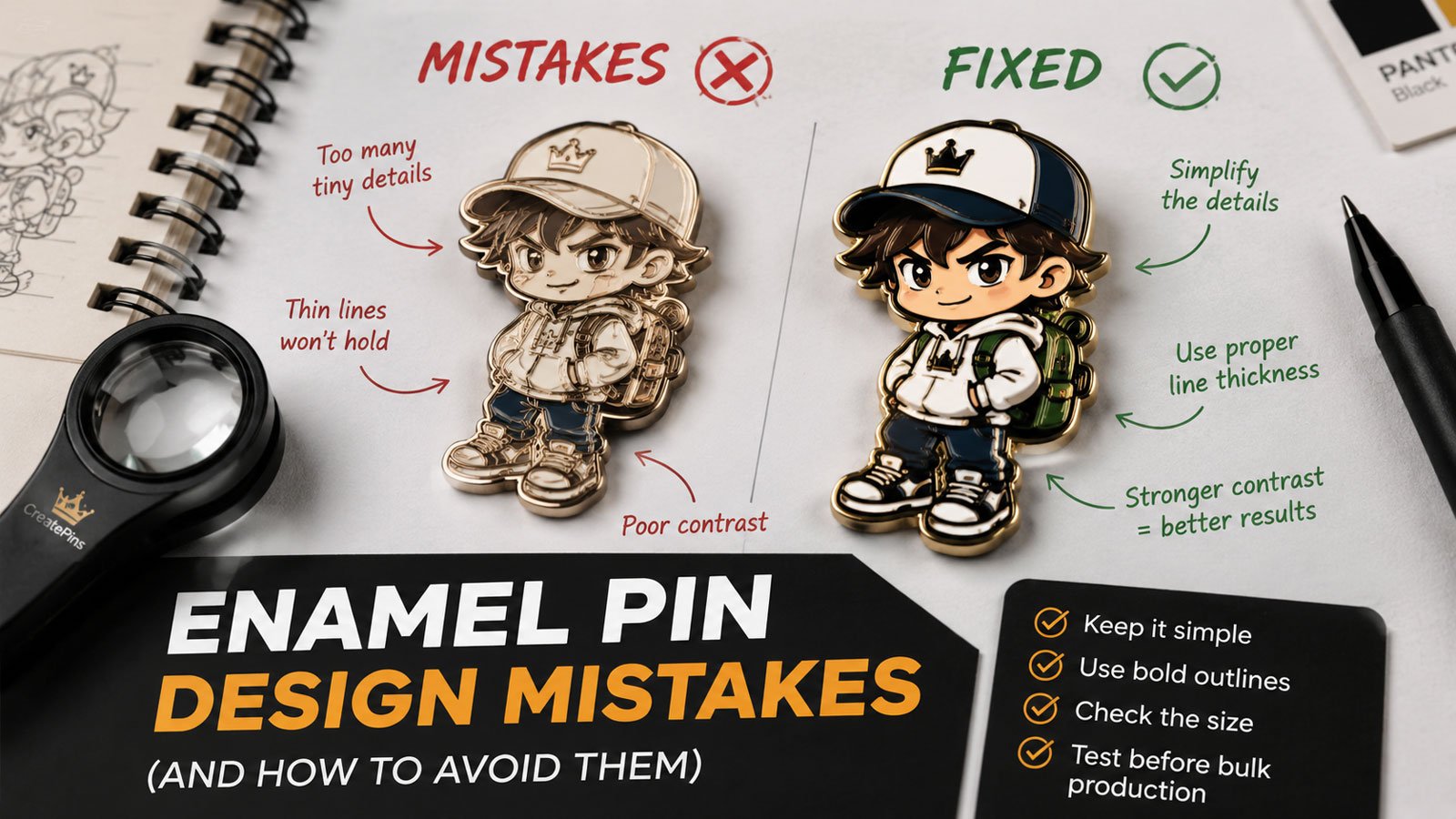
Designing a custom enamel pin may look simple on screen — but artwork that looks perfect digitally can create serious problems once it reaches the manufacturing stage. Thin lines disappear. Tiny text becomes unreadable. Colors lose contrast. Gradients can't translate to traditional enamel. A design that looks excellent at 4 inches becomes confusing at 1 inch.
The good news: most enamel pin design mistakes are preventable. This guide covers the most common artwork, color, sizing, file, and production mistakes that cause revisions, delays, unexpected costs, and disappointing results — and explains how to fix each one before your mold is made.
For a full walkthrough of the design process from concept to finished pin, start with our complete enamel pin design guide.
The 20 Most Common Enamel Pin Design Mistakes
1 Making the Enamel Pin Design Too Detailed
One of the most common mistakes is trying to fit too much artwork into a small physical object. A digital illustration can contain hundreds of tiny details because a monitor gives you unlimited space to zoom in. An enamel pin may only be 1–2 inches wide.
Fine textures, tiny decorative elements, small facial features, intricate patterns, and dense backgrounds can become difficult or impossible to reproduce clearly.
- Fine details disappear entirely in the mold
- Small color areas don't fill cleanly
- The design looks crowded and muddy
- Important elements lose visual hierarchy
- Production requires artwork revisions
- The finished pin looks nothing like the original illustration
- Identify the single most important visual element
- Ask: "If I remove half the details, is it still recognizable?"
- Simplify until the silhouette reads clearly
- Use strong color blocks and generous negative space
- View the artwork at its actual physical size, not zoomed in
A design that looks excellent at 400% zoom is irrelevant if it becomes unreadable at 100% physical size. Always judge your artwork at the size it will actually be worn.
2 Using Lines That Are Too Thin
Metal lines aren't merely decorative on an enamel pin — they separate enamel color areas and form part of the physical structure of the design. If a line is too thin, it may not reproduce reliably during die and mold production.
As a practical starting point, many enamel pin designs use metal lines around 0.2–0.3 mm or thicker, although the appropriate minimum depends on pin size, construction, enamel type, and manufacturer capabilities.
- Lines may disappear completely
- Adjacent colors bleed visually together
- Tiny gaps close up during production
- Details lose definition and clarity
- The manufacturer has to modify your artwork
- Use 0.2–0.3mm minimum for important metal lines
- Increase the pin size if delicate linework is essential
- Simplify the artwork and remove unnecessary strokes
- Use printed elements where enamel can't hold the detail
- Work in vector files so stroke widths can be controlled precisely
Vector artwork makes line-weight control straightforward. Never submit a raster image (JPG, PNG) as your primary artwork — stroke widths can't be measured or adjusted without vector data.
3 Making Text Too Small
Text that looks perfectly readable on your monitor may become difficult to read once it's converted into metal and enamel. This is especially problematic with thin serif fonts, script fonts, decorative fonts, long phrases, small numbers, tight letter spacing, and curved text.
- Thin serif letterforms collapse or merge in the mold
- Script and decorative fonts lose their character
- Long text at small size becomes completely illegible
- Tight kerning causes letters to blur into each other
- Use short, bold, simple sans-serif lettering
- Treat roughly 5–6 pt as a starting reference, not a universal minimum
- Increase letter spacing for better separation
- Move non-essential wording to a backing card, packaging, or back stamp
- Always review the artwork at actual physical size before production
Readability depends on font weight, letter spacing, pin size, and manufacturing method — not just point size. For a deeper breakdown, see our enamel pin typography guide.
4 Choosing Colors Without Enough Contrast
Two colors can look clearly different on your monitor but appear surprisingly similar once they become physical enamel. This makes the finished pin look muddy or less detailed than expected — and it's especially damaging in product photography, where unclear designs simply don't convert.
- Similar shades placed next to each other
- Dark colors against dark metal plating
- Low-contrast text on a busy background
- Too many subtle color variations
- Expecting screen colors to perfectly match physical enamel
- Pair dark + light or warm + cool in adjacent areas
- Use saturated + neutral combinations for hierarchy
- Consider bright enamel against dark plating
- Limit the palette so each color has room to read
- Always request a production proof before approving
The goal is not simply to use more colors — it's to make important shapes easy to distinguish. Contrast, not color count, is what makes a pin readable at wearing distance.
5 Relying Only on RGB or HEX Color Codes
RGB and HEX values are useful for digital artwork, but physical enamel doesn't behave like a computer display. Your monitor produces light; enamel is a physical material viewed under real lighting conditions. That's why screen colors can look noticeably different from the finished pin.
- The manufacturer has to guess at your intended color
- Brand colors come back noticeably off
- Repeat orders don't match the original run
- Visually similar colors are impossible to distinguish
- Provide Pantone / PMS references for every enamel color
- Review the manufacturer's production proof carefully
- Do this especially for strict brand colors and repeat orders
- Keep a written color spec so future reorders stay consistent
Pantone references are a standardized physical color language. RGB and HEX are display values — they change from screen to screen. For the full explanation, read why enamel pin colors look different from your screen.
6 Creating Floating or Open Color Areas
Traditional enamel production generally requires colored areas to be contained by metal boundaries. A common artwork problem is creating an isolated color shape without giving it an appropriate metal structure. Think of an enamel pin like stained glass: the metal framework separates and supports the colored sections.
- An isolated color area may not be manufacturable as drawn
- Color boundaries need to be redesigned
- Additional metal lines must be added
- The manufacturer has to simplify your artwork
- Give important enamel areas clear metal separation
- Connect floating elements to another metal section
- Add a surrounding metal border where needed
- Enlarge or simplify elements that can't be framed
- Convert tiny floating details to printed elements
Every colored pane in stained glass is surrounded by a lead border. If a color area doesn't have a complete metal border on all sides, that color cannot be filled reliably.
7 Using Gradients in Standard Enamel Artwork
Traditional soft and hard enamel use separated color fills rather than a continuous Photoshop-style gradient. That means a smooth transition from one color into another cannot normally be reproduced using standard enamel alone — a frequent source of disappointment for digital artists making their first pin.
- Sunset and sky gradients
- Airbrushed shading
- Soft shadows and fades
- Metallic reflections
- Photorealistic lighting
- Convert gradients into distinct solid-color sections
- Instead of dark blue → purple → pink, use three separate fills with metal separation
- Use 2–3 hard-edged tones to suggest shading
- Ask about UV printing or screen printing if gradients are essential
Treat enamel like screen printing or risograph — every color is a flat, separate layer. This constraint often forces a bolder, cleaner design that actually performs better as a pin.
8 Adding Too Many Digital Effects
Drop shadows, glows, blur, transparency, lens effects, soft highlights, and realistic lighting can make digital artwork look impressive. However, these effects don't automatically translate into traditional enamel.
- Glow and bloom
- Blur and soft focus
- Transparency and layer opacity
- Drop shadows
- Airbrushed highlights
- Photorealistic textures and complex lighting
- Digital glow → solid highlight area
- Gradient shading → two or three solid color areas
- Fine texture → simplified metal or enamel pattern
- Preserve the visual idea rather than reproducing every effect literally
Ask yourself what each effect is actually communicating — light, depth, shine, texture — then express that idea using solid fills and metal lines instead.
Not sure whether your artwork is production-ready? Our team reviews your design and flags every issue before the mold is cut — free.
Submit Your Design for Free Review →9 Designing Without Considering the Final Pin Size
Pin size should be part of the design process from the beginning. A design created for a 4-inch illustration cannot always be reduced successfully to a 1-inch pin. As the artwork becomes smaller, text becomes harder to read, lines become thinner, color areas shrink, fine details disappear, and the overall composition becomes crowded.
| Design Complexity | Typical Starting Size |
|---|---|
| Simple logo | 1–1.25 in |
| Mascot or simple character | 1.25–1.5 in |
| Detailed character | 1.5–2 in |
| Highly detailed artwork | 2 in or larger |
- Critical detail is lost when scaled down
- Elements that read at 4" become unreadable at 1"
- Size is chosen as an afterthought, forcing a redesign
- Oversized pins inflate mold and material costs unnecessarily
- Decide your pin size first, then design for it
- Work at 1:1 scale in your software from the start
- Print at actual size and pin it to a jacket or bag
- Check readability from 1–3 feet — the real viewing distance
These are design guidelines, not fixed manufacturing rules. If your artwork is highly detailed, increasing the physical size may solve several problems at once. See our enamel pin size and thickness guide for exact specs.
10 Choosing the Wrong Pin Type
Not every artwork style should automatically become a traditional soft enamel pin. Different production methods create distinctly different visual results — and the wrong choice can't be undone after production.
- Hard enamel chosen for budget merch — needlessly expensive
- Soft enamel chosen for a luxury product — undermines positioning
- Standard enamel used for gradient-heavy artwork that needs printing
- Match the method to your artwork, quantity, budget, and intended use
- Bold flat-color designs → soft enamel (or hard for premium)
- Gradient or photo-real detail → printed pin
- Ask your manufacturer which type suits your specific design
Still deciding? Our hard enamel vs. soft enamel pins comparison breaks down cost, durability, and appearance side by side.
11 Creating Fragile Shapes or Difficult Cut Lines
The outside silhouette of a pin is part of its engineering. Very narrow extensions, extremely sharp internal corners, tiny openings, and fragile protrusions can create manufacturing or durability problems — they bend during shipping, fail inspection, or break at the attachment point over time.
- Extremely thin antennae
- Long narrow spikes
- Fragile tails and feathers
- Very sharp internal corners
- Tiny holes that can't be cut cleanly
- Long unsupported extensions
- Thicken narrow extensions
- Slightly round sharp corners
- Increase the size of tiny openings
- Simplify complicated cut lines
- Ask the manufacturer to review the die-cut outline
Thin protrusions — an antenna, a long feather, a narrow tail — are the most common structural failure point. If any element is narrower than roughly 2mm at its thinnest point, it needs reinforcement or redesign before production.
12 Using Too Many Colors in a Small Pin
When many colors are squeezed into a small area, each color section becomes smaller and the design becomes visually confusing. More color areas also mean more metal walls, more complexity, and higher production cost.
- Each color area becomes too small to read
- The design looks busy and visually confusing
- Color count increases cost without improving impact
- Small fills are harder to produce cleanly
- Combine similar shades into one
- Remove unnecessary highlights
- Use a limited, deliberate palette
- Increase the pin size if more detail is genuinely needed
- Use printed details where appropriate
For many designs, a small number of well-chosen colors produces a stronger result than a large palette. A 3–6 color range is a reliable target for most pins.
13 Submitting the Wrong Artwork File
One of the easiest ways to create unnecessary production work is to send only a screenshot, social-media image, or low-resolution JPG. A good production file should let the manufacturer clearly identify shapes, line weights, color areas, text, and the intended final size.
- Screenshots
- Downloaded social-media images
- Low-resolution JPGs
- Blurry reference images
- Artwork with flattened, unlabeled layers
- AI (Adobe Illustrator)
- EPS
- Vector PDF
- SVG
- High-resolution PNG or PSD only when vector isn't available
Vector is preferred because it preserves scalable shapes and allows precise editing. For a full comparison, see our guide to the best file formats for custom enamel pins — and if you're working from generated artwork, read how to convert AI artwork into enamel pins.
14 Forgetting to Convert Fonts to Outlines
If you send editable artwork containing fonts your manufacturer doesn't have, the text can change when the file is opened on another computer. That can affect font appearance, letter spacing, text width, and overall layout — often without anyone noticing until the proof stage.
- Font substitution changes the look of your logo
- Letter spacing shifts unexpectedly
- Text width changes and breaks the layout
- Wording renders incorrectly on the final proof
- Convert final production text to outlines or paths
- Keep an editable master file with live text stored safely
- Send outlines for production and keep live text for yourself
This gives you the best of both worlds: production-ready artwork that renders identically everywhere, plus an editable original you can update for future runs.
15 Ignoring the Metal Plating
The metal finish isn't merely a finishing decision made at the end — it's part of the visual design. Gold, silver, black nickel, and antique finishes can dramatically change how the same enamel colors appear.
- Plating competes with the enamel instead of supporting it
- Dark colors disappear against dark plating
- The finished pin feels visually flat or unbalanced
- The plating choice has to be revisited late in the process
- Consider your plating choice while designing the artwork
- Make sure the metal contributes to the design rather than fighting it
- Antique finishes can create a vintage, weathered appearance
- Ask for a proof showing your colors against the chosen plating
Want a full breakdown of options? Read our enamel pin plating colors guide before you finalize your artwork.
16 Choosing a Design That Doesn't Match the Intended Use
A pin for a premium collector edition doesn't necessarily need the same specifications as a promotional giveaway. Good design isn't only about appearance — it's also about matching the product to its purpose.
- Premium finishing applied to a low-cost giveaway
- Basic specs used for a limited collector release
- Packaging and backing don't match the product tier
- Budget spent on the wrong element
- Is this a collectible or promotional merchandise?
- Will people wear it on jackets and bags?
- Is it a limited edition or an event giveaway?
- Is it part of a premium brand collection?
Your answers influence pin type, size, thickness, plating, backing, packaging, numbering, and finishing options — so decide these before the artwork is finalized.
17 Skipping the Manufacturer's Technical Review
A professional manufacturer should review your artwork before production and identify issues such as thin lines, tiny text, difficult color separation, fragile cut lines, small enamel areas, incorrect file setup, and artwork that doesn't suit the selected production method. This review is particularly important before a mold or die is finalized.
- Production errors requiring expensive mold modifications
- An entire batch delivered with avoidable quality issues
- Costly reprints at full production cost
- Delays while problems are diagnosed after the fact
- Always request a production proof before mold creation
- Ask the manufacturer to flag any concerns with your design
- Work with manufacturers who offer design optimization
- Don't choose a supplier on unit price alone
A manufacturer that identifies problems before production can save you far more money than a small difference in quoted unit cost. For what to expect at each stage, see our guide to production expectations and tolerances.
Need help turning your digital artwork into a production-ready pin design? Our team does this for free with every quote.
Get Free Design Assistance →18 Approving a Digital Proof Without Checking Actual Size
A digital proof can look excellent on a large monitor. That doesn't mean the physical pin will look identical. Before approving your final production proof, check it at the size it will actually be produced.
- Small details look fine zoomed in but vanish at real size
- Text that seemed readable is illegible on the pin
- Metal borders and color separation issues are missed
- Plating and backing details go unverified
- Pin dimensions and overall proportions
- Text readability at actual size
- Metal borders and color separation
- Plating, backing position, and special finishes
- Print the design at 100% and physically look at it
Printing your proof at 100% size and holding it in your hand is a five-second test that reveals problems no amount of screen zooming will catch.
19 Making Important Changes After Approval
Once production moves forward, changes become increasingly expensive and disruptive. A change made during the design stage is usually much easier than a change made after a mold has been created or production has started. Don't rush the final approval simply because you're eager to begin.
- Mold modifications at additional cost
- Production delays and rescheduled ship dates
- Rejected artwork and re-proofing cycles
- Higher total cost than the original quote
- Final artwork, pin size, and pin thickness
- Enamel type, plating, and colors
- Backing, quantity, and packaging
- Special finishes and sample requirements
A few extra minutes of careful review can prevent much bigger problems later. For how each stage fits together, see our custom enamel pin production timeline.
20 Ordering a Large Quantity Before Testing the Design
A design may look excellent digitally and still need refinement after you see a physical sample. This is especially important for highly detailed artwork, small pins, specialty finishes, unusual shapes, complex color combinations, premium products, and large commercial orders.
- Colors arrive different from what you expected
- Line definition or enamel fill doesn't match the proof
- The pin feels too small, too thin, or too light
- An entire batch is produced with an avoidable flaw
- Discuss physical sampling before committing to full quantity
- Evaluate actual color, metal finish, and line definition
- Check enamel fill, size, thickness, and overall appearance
- Approve only after holding the real product in your hand
For complex or high-value projects, a sample is a quality-control step — not an extra expense. See our custom enamel pin sample approval process and our breakdown of the hidden costs of custom enamel pins to plan ahead.
The Complete Enamel Pin Design Pre-Production Checklist
Before sending your artwork to a manufacturer, work through this checklist. It takes a few minutes and can save you hundreds of dollars in revisions, reorders, and delays.
Artwork
- Main subject: The primary element is immediately recognizable at a glance.
- Simplified: Unnecessary details have been removed. The silhouette reads clearly.
- Actual size: The design works at its intended physical size, not just zoomed in. Need a mockup? See how to make a custom enamel pin mockup.
- Visibility: Every important element is clearly visible at 1 inch on screen.
Lines & Shapes
- Line weight: Important metal lines are at least 0.2–0.3mm. No hairline strokes remain.
- Protrusions: Thin extensions are thickened and structurally sound.
- Cut lines: The outline is practical. No tiny holes or fragile extensions.
- Metal borders: Every color area is fully enclosed. No floating or open-ended sections.
Text
- Necessary: The wording is essential to the design — or it's been moved to the backing card.
- Font weight: Bold, simple lettering. No thin serifs or decorative scripts.
- Readability: Text is legible when printed at actual pin size, with adequate letter spacing.
- Outlines: Final production fonts have been converted to outlines or paths.
Colors
- Contrast: All neighboring colors have strong visual contrast. No similar shades side by side.
- Palette: Unnecessary colors have been removed. The palette is limited and deliberate.
- Pantone: PMS references are available for every color where appropriate.
- Plating: You've considered how the metal finish will affect the enamel colors.
Production Method
- Pin type: Soft enamel, hard enamel, or printing is appropriate for this artwork.
- No gradients: All color areas use solid flat fills. Shading is simplified into 2–3 tones.
- Effects: Digital effects have been converted into manufacturable elements.
- Finishes: Any specialty finishes are clearly identified and confirmed.
Files
- Vector: The primary artwork is vector-based (AI, EPS, PDF, or SVG) where possible.
- Organized: Layers are named and organized logically.
- Sized: The final artwork is saved at the intended production size.
- Master file: An editable master file is safely stored on your side.
Final Approval
- Reviewed: The manufacturer has reviewed the artwork and flagged any concerns.
- Proof checked: You've examined the digital proof carefully and at actual size.
- Confirmed: Size, thickness, plating, backing, colors, and quantity are all verified.
- Sampling: You've decided whether a physical sample is needed for this project.
✅ A great enamel pin starts with artwork designed for manufacturing — not simply artwork that looks good on a screen. Take these steps before your mold is created and you'll reduce revisions, avoid delays, and give yourself a much better chance of receiving a finished pin that matches your original concept.
Get Your Artwork Reviewed Before Production
Submit your design to CreatePins and our team will identify potential manufacturing issues, recommend practical adjustments, and flag every problem before a single mold is cut — free design review, free optimization suggestions, no hidden fees.
Frequently Asked Questions
Overcomplicating the design is one of the most common problems. Too many small details, thin lines, tiny text, and crowded color areas can become difficult to manufacture or understand at actual pin size.
A practical starting guideline is around 0.2–0.3 mm for important metal lines, but the appropriate minimum depends on the design, pin size, construction, and manufacturer's capabilities. Always confirm the final production specification with your manufacturer.
There is no single universal minimum because readability depends on the font, stroke weight, spacing, pin size, and manufacturing method. As a practical design starting point, around 5–6 pt can be considered for small text, but critical wording should be tested at actual physical size.
Traditional soft and hard enamel generally use separate solid color areas rather than smooth gradients. If your design depends on gradients, discuss alternatives such as UV printing or screen printing with your manufacturer.
Yes, a high-resolution PNG can be used as a reference, but vector artwork such as AI, EPS, vector PDF, or SVG is generally preferable for production because it gives the manufacturer much better control over line weights, shapes, and color separation.
Digital artwork is displayed using light on a screen, while an enamel pin is a physical product made from metal, enamel, plating, and other materials. Screen colors, physical enamel, metal finishes, and lighting conditions can therefore produce differences in appearance.
Pantone/PMS references provide a standardized color reference that is more useful for physical production than relying only on the RGB or HEX values displayed by a particular monitor.
You can, but tiny text becomes increasingly difficult to reproduce and read as the pin gets smaller. Use short, bold wording and test it at actual size. If detailed text is important, consider placing it on the backing card instead.
Yes. Designing at or frequently checking against the intended physical size helps you identify problems with text, line thickness, detail, and spacing before production.
AI, EPS, vector PDF, and SVG are generally preferred because they preserve scalable shapes and allow precise editing. High-resolution PNG or PSD files can also be useful references when vector artwork is unavailable.
In many cases, yes. An experienced manufacturer can identify manufacturing problems and recommend or make adjustments before production. At CreatePins, artwork review and design support can help identify issues before the mold is created.
For complex or high-value projects, a physical sample can be a valuable quality-control step. It lets you evaluate the actual colors, plating, size, line definition, enamel fill, and overall appearance before committing to the full quantity.
No. A successful pin needs to remain recognizable at its actual physical size. A simpler design with strong shapes, good contrast, and clear details can look much better than a highly detailed design that becomes visually crowded.
Why Fixing Design Problems Before Production Matters
Most artwork problems are inexpensive to solve before production. A manufacturer can often adjust a line, simplify a shape, change a color, enlarge text, or recommend a different production method while the project is still in the artwork and proofing stage.
The situation changes once production begins. A preventable artwork mistake can result in additional revisions, production delays, mold changes, rejected artwork, color dissatisfaction, difficult reorders, increased costs, and a finished product that doesn't match the original expectation. That's why production-ready artwork should be treated as part of the manufacturing process — not as something separate from it.
And if you're producing pins to sell, those extra costs come directly out of your margin. Planning your quantities and unit costs early — see our guide to pricing custom enamel pins — is far easier when the design doesn't need to be reworked after the mold is cut.
What If My Artwork Isn't Production-Ready?
You don't necessarily need to redesign everything yourself. An experienced enamel pin manufacturer can review your artwork and identify what needs to change before production. Typical adjustments include simplifying fine details, increasing line thickness, improving color separation, adjusting text, strengthening fragile shapes, converting artwork into production-ready vectors, recommending a different pin type, adjusting the pin size, and suggesting printing for details that don't work well as enamel.
The best result isn't always the artwork that looks most complicated on screen. It's the artwork that survives the transition from digital illustration to physical product while keeping the original idea recognizable — the same principle covered in our complete enamel pin design guide.
References & Further Reading
- CreatePins — Complete Enamel Pin Design Guide (2026)
- CreatePins — Enamel Pin Typography Guide: How to Make Text Readable on Small Pins
- CreatePins — Perfect Size & Thickness Guide for Enamel Pins (2026)
- CreatePins — Best File Formats for Custom Enamel Pins
- CreatePins — Beginner's Guide to Enamel Pin Plating Colors
- CreatePins — Hard Enamel vs. Soft Enamel Pins: Differences, Costs & Mistakes
- CreatePins — Custom Enamel Pin Production Expectations & Tolerances
- CreatePins — Custom Enamel Pin Sample Approval Process
- CreatePins — Why Enamel Pin Colors Look Different From Your Screen
- CreatePins — How to Convert AI Artwork into Enamel Pins
- CreatePins — How to Make Your Own Custom Enamel Pin Mockup
- CreatePins — Custom Enamel Pin Production Timeline
- CreatePins — Pricing Custom Enamel Pins for Profit
- CreatePins — The Hidden Costs of Custom Enamel Pins
- CreatePins — Common Enamel Pin Defects & How CreatePins Prevent Them
- CreatePins — Translucent Enamel Pin Design Guide
- CreatePins — Glitter Enamel Pins: The Complete Guide to Sparkle
- CreatePins — Pearl Swirl Enamel Pin Design Guide: Limits, Risks & Pro Tips
- CreatePins — The Ultimate Guide to Enamel Pin Add-Ons: Glitter, Glow, Epoxy, Spinners & More (2026)
- CreatePins — Epoxy Dome Pins: Complete Guide to Finishing, Design & When to Use It (2026)
- CreatePins — Enamel Pin Thickness Explained: How It Affects Quality, Durability, and Cost
- CreatePins — Minimalist vs. Detailed Enamel Pin Designs: Which Style Sells Better?
- CreatePins — 15 Enamel Pin Design Ideas That Always Sell
- CreatePins — What Enamel Pin Manufacturers Don't Tell You Before Ordering
- CreatePins — How We Help First-Time Pin Creators Succeed
- CreatePins — Back Stamps & Sequential Numbering for Enamel Pins
- CreatePins — Enamel Pin Backing Cards: Complete Design, Size, Printing & Finish Guide (2026)
- CreatePins — Complete Enamel Pin Packaging Guide: Types, Costs & Best Practices (2026)
- CreatePins — Essential Criteria for Grading Enamel Pins: Complete Quality Standards
- CreatePins — Want More Than Just Custom Pins?